Figma, FigJam
UX Researcher, Product Designer
3-person research team → Solo design
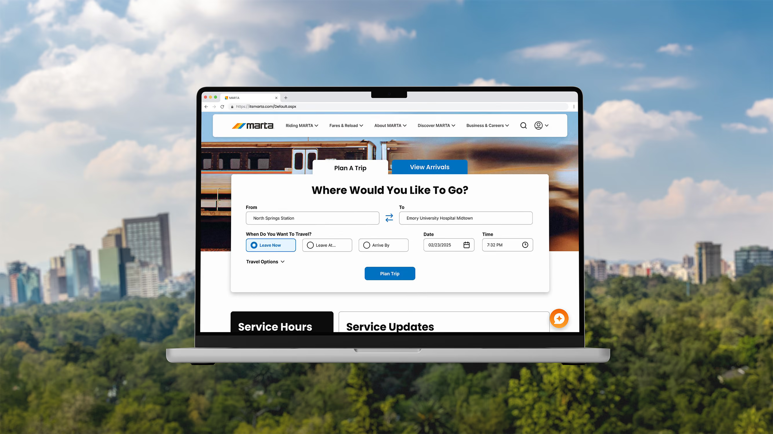
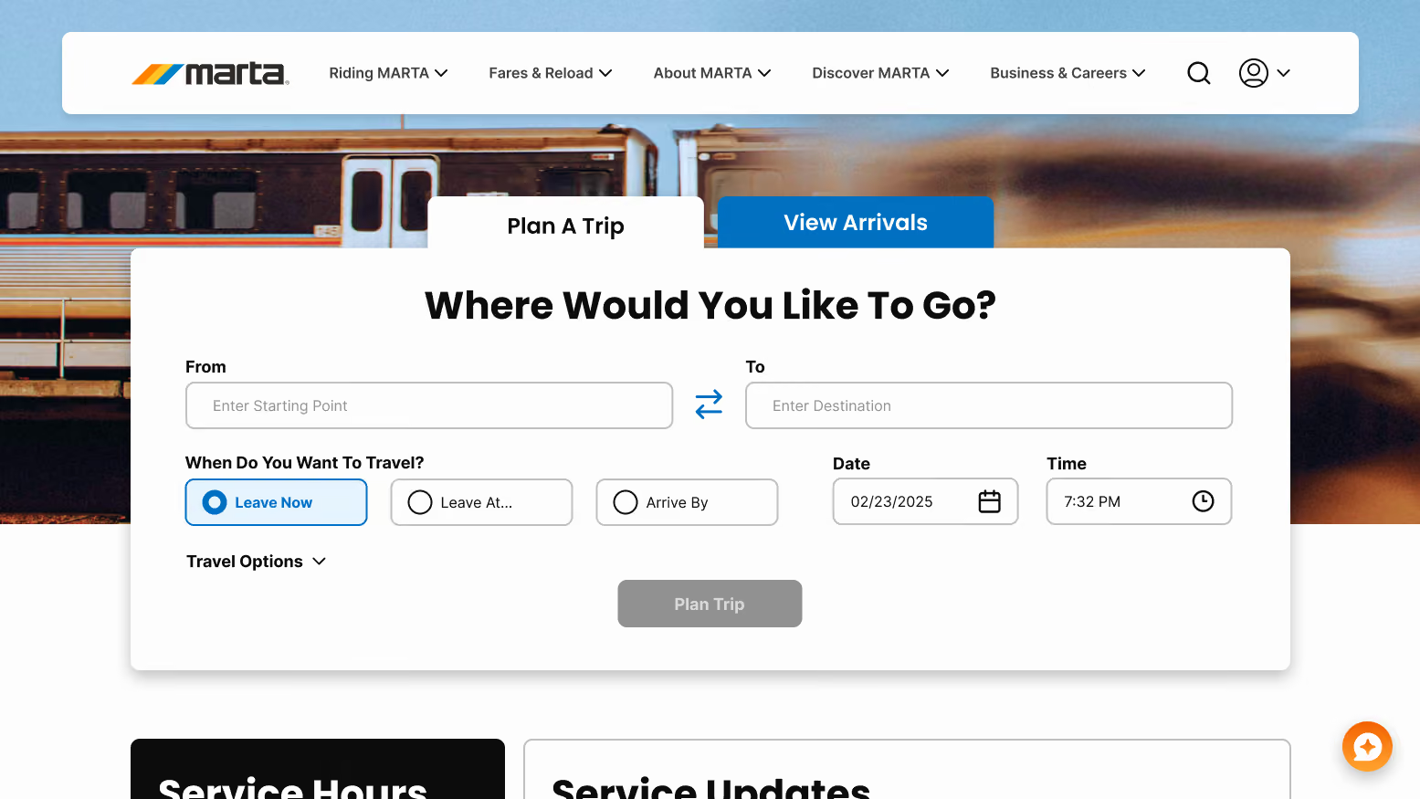
MARTA's (Metropolitan Atlanta Rapid Transit Authority) website operates a complex multi-modal system with a large volume of genuinely necessary content. The challenge wasn't cutting information from their interfaces, it was untangling years of overlapping, redundant, and misleadingly named menu items. The solution was a complete overhaul and redesign of the MARTA website, built around mental models riders already had: Plan, Fares, and Alerts.
This project began as a collaborative research effort with two teammates, covering heuristic evaluation, user interviews, survey, competitive analysis, card sorting, and usability testing. Once the research phase concluded, I designed solo, owning the full product design process from information architecture through the final high-fidelity prototype.
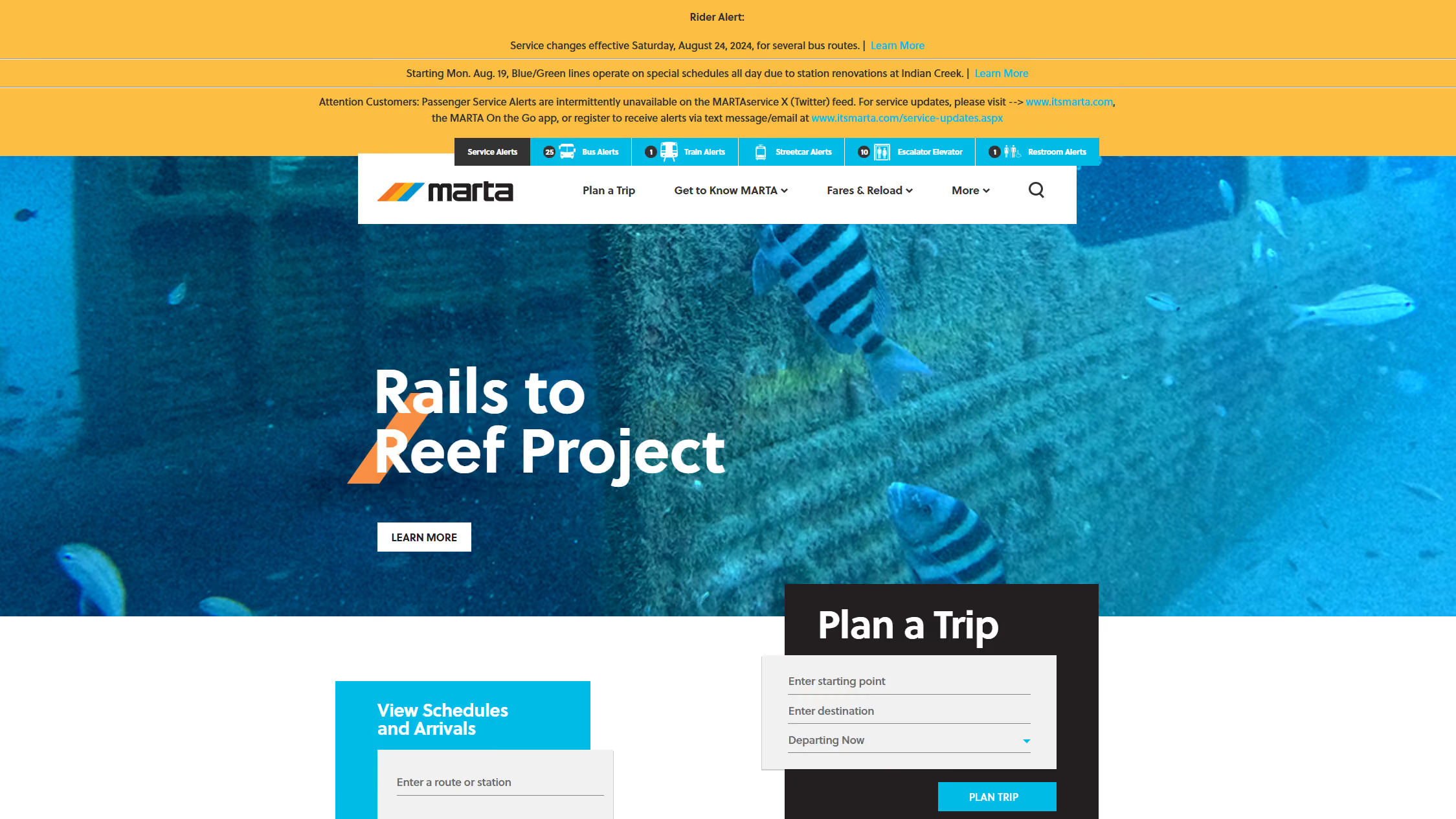
MARTA's website had accumulated years of structural debt. Their information was organized around how the agency's departments were structured internally, not how a rider thinks about getting somewhere.

Confusing navigation
Menu items like Train Stations & Schedules and Interactive Map overlapped in name but led to entirely different pages.
Information overload
Service alerts were displayed as unformatted text walls with no filtering, icons, or hierarchy, making critical updates easy to miss.
complex Breeze flow
Reloading or checking a balance sends riders to a separate site with an outdated UI and a lengthy flow, which can be confusing for new users.
The research phase was a full team effort. We followed a structured plan, moving from raw observation through synthesis to clearly highlight the site's failures and riders' real needs.
To ensure our findings reflected both individual experience and broader patterns, we combined qualitative interviews with a quantitative survey, then synthesized both into an affinity diagram to surface the patterns that shaped our design direction.
Hover over the rings for research details!
Tap on the rings for research details!
To ensure our findings reflected both individual experience and broader patterns, we combined qualitative interviews with a quantitative survey, then synthesized both into an affinity diagram to surface the patterns that shaped our design direction.
Riders preferred Google Maps over MARTA's platform due to unreliable updates and a confusing interface.
Uncertainty around departure timing caused riders to leave earlier than needed, adding unnecessary stress to their day,
Real-time arrivals and schedules were the most-used features but required the most effort to access.
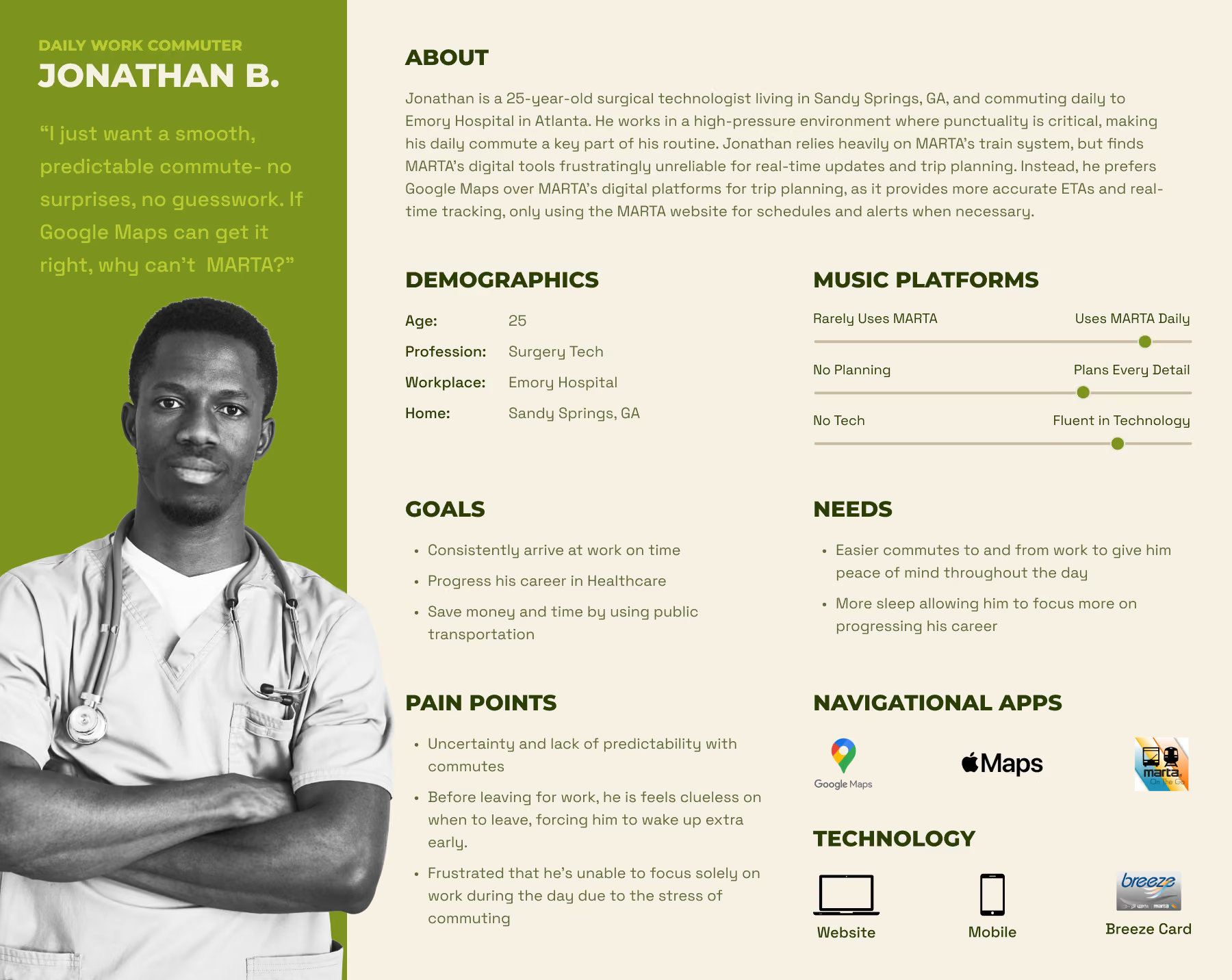
To bring our research findings to life, we developed a user persona that offered a comprehensive view of the target user that will guide my design decisions.
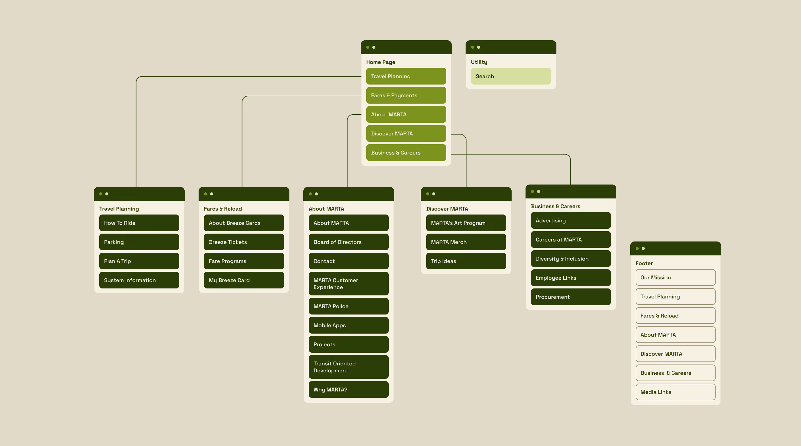
Guided by our research insights, I ventured into solo discovery. Through card sorting, I learned how riders intuitively organize transit information, which I then used to create a site map and user flows, establishing the structural basis for the redesign.
Enhance the commuting experience for MARTA riders so that they can navigate their journey seamlessly, stay informed in real time, and optimize their time and costs efficiently?
I ran a card sort to understand how riders naturally expected content to be grouped. Each session was conducted without supervision to give participants the freedom to organize content as they saw fit.

Using card sort insights, we redesigned MARTA's site map to better match the way users think, creating a smoother navigation experience.
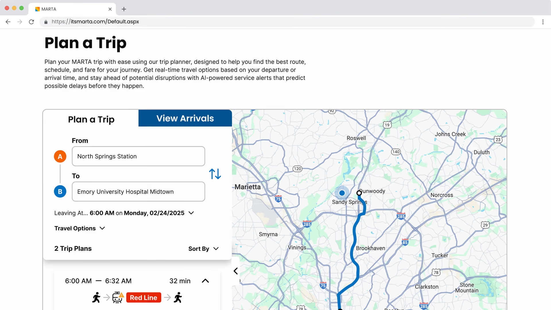
Mapped a step-by-step user flow for the trip planning experience, ensuring the path was as direct and frictionless as possible before any visual design began.
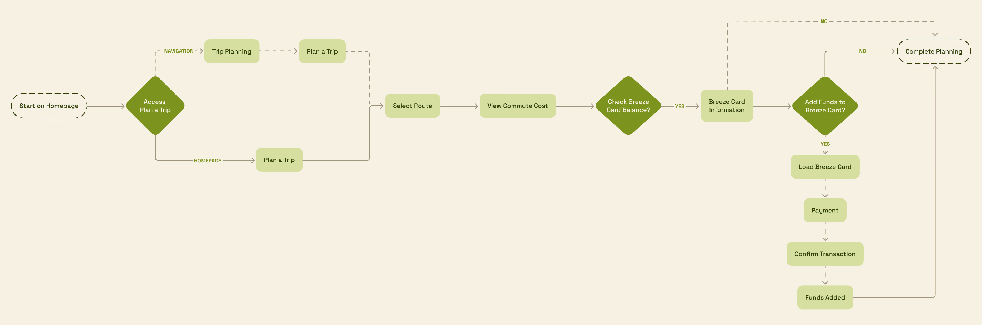
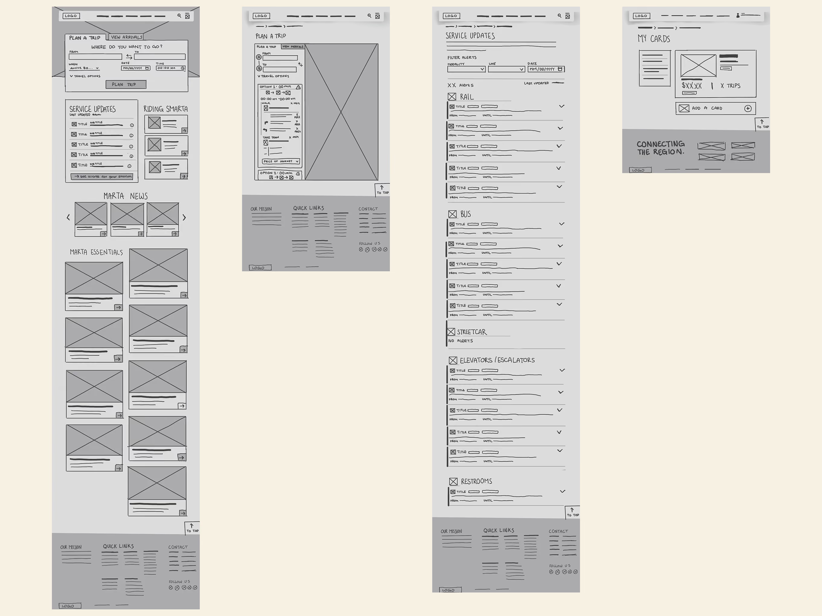
With a clear structure in place, I moved into ideation: sketching, testing, and refining the layout before locking in the final visuals.
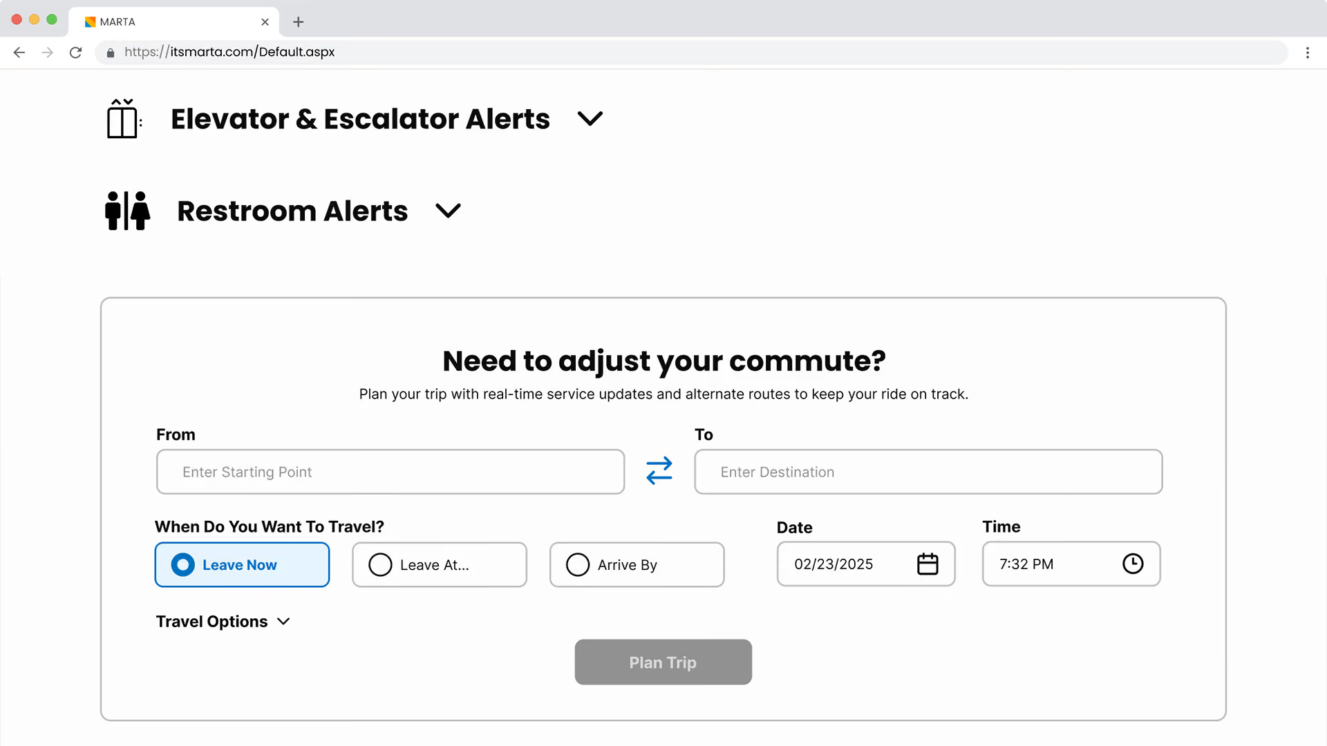
I started with a quick hand-drawn sketch to test the overall layout, then brought it into Figma as a mid-fidelity wireframe to add defined components, spacing, and interaction patterns across the homepage, trip planner, alerts page, and Breeze card reload flow.
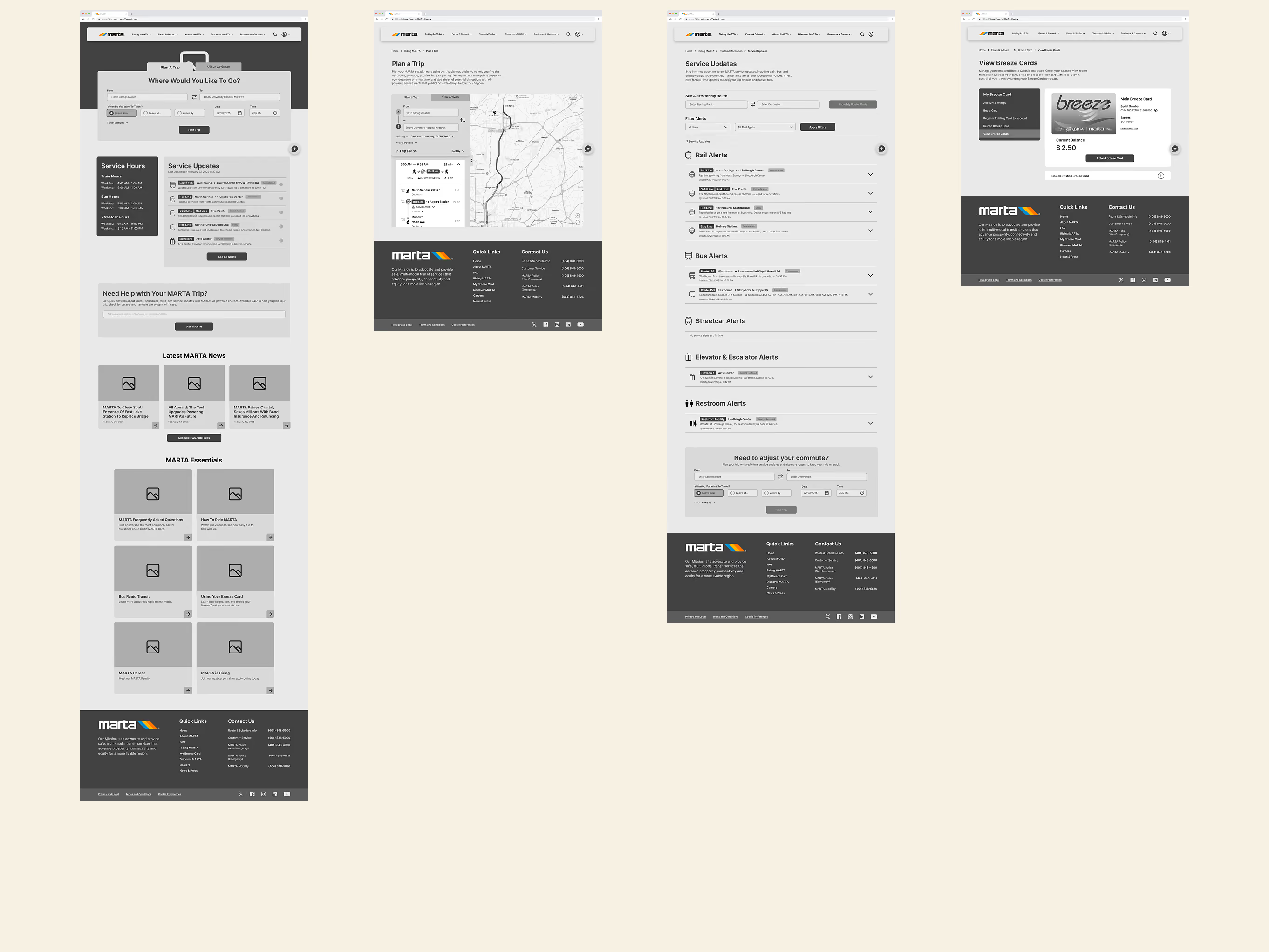

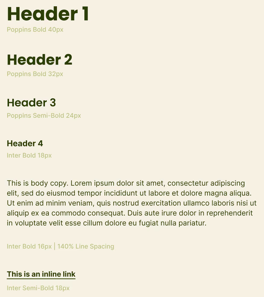
The visual style emphasizes clarity and familiarity, staying true to MARTA's brand while making the interface more approachable and easier to navigate.
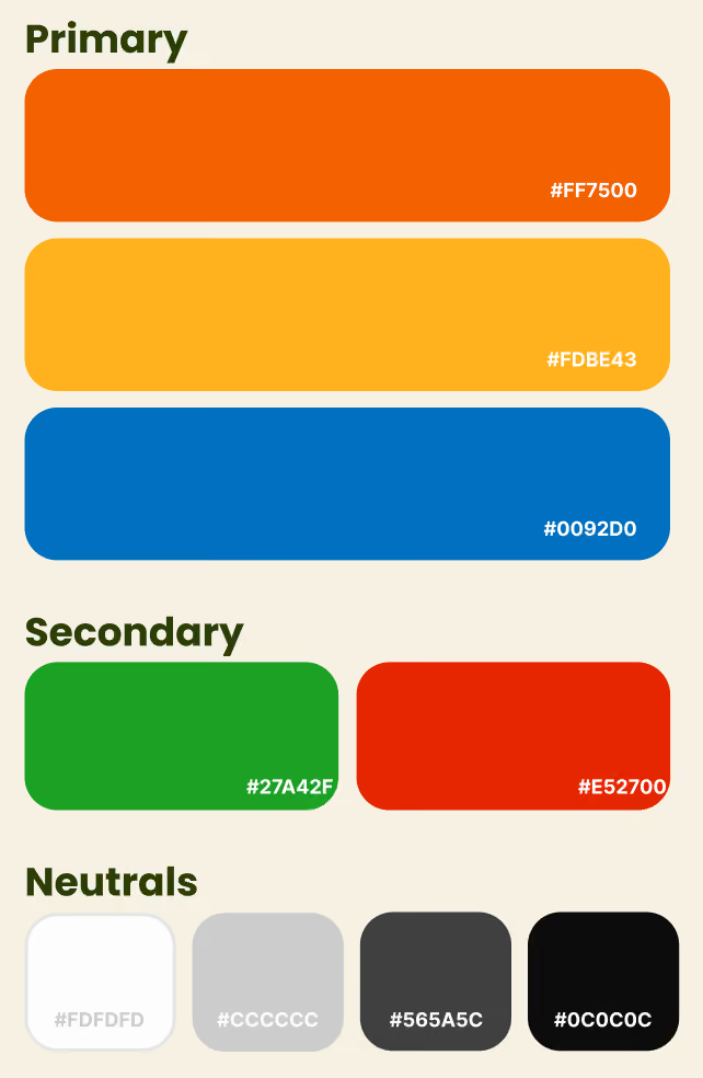
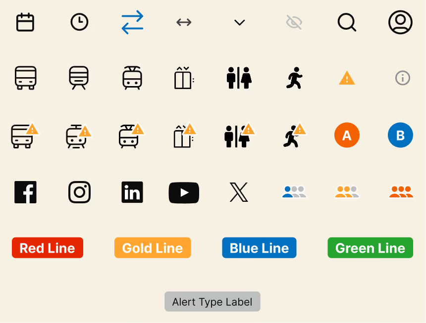
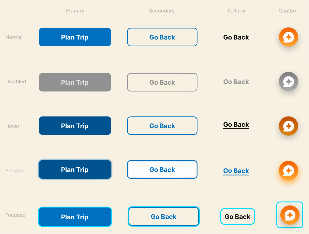
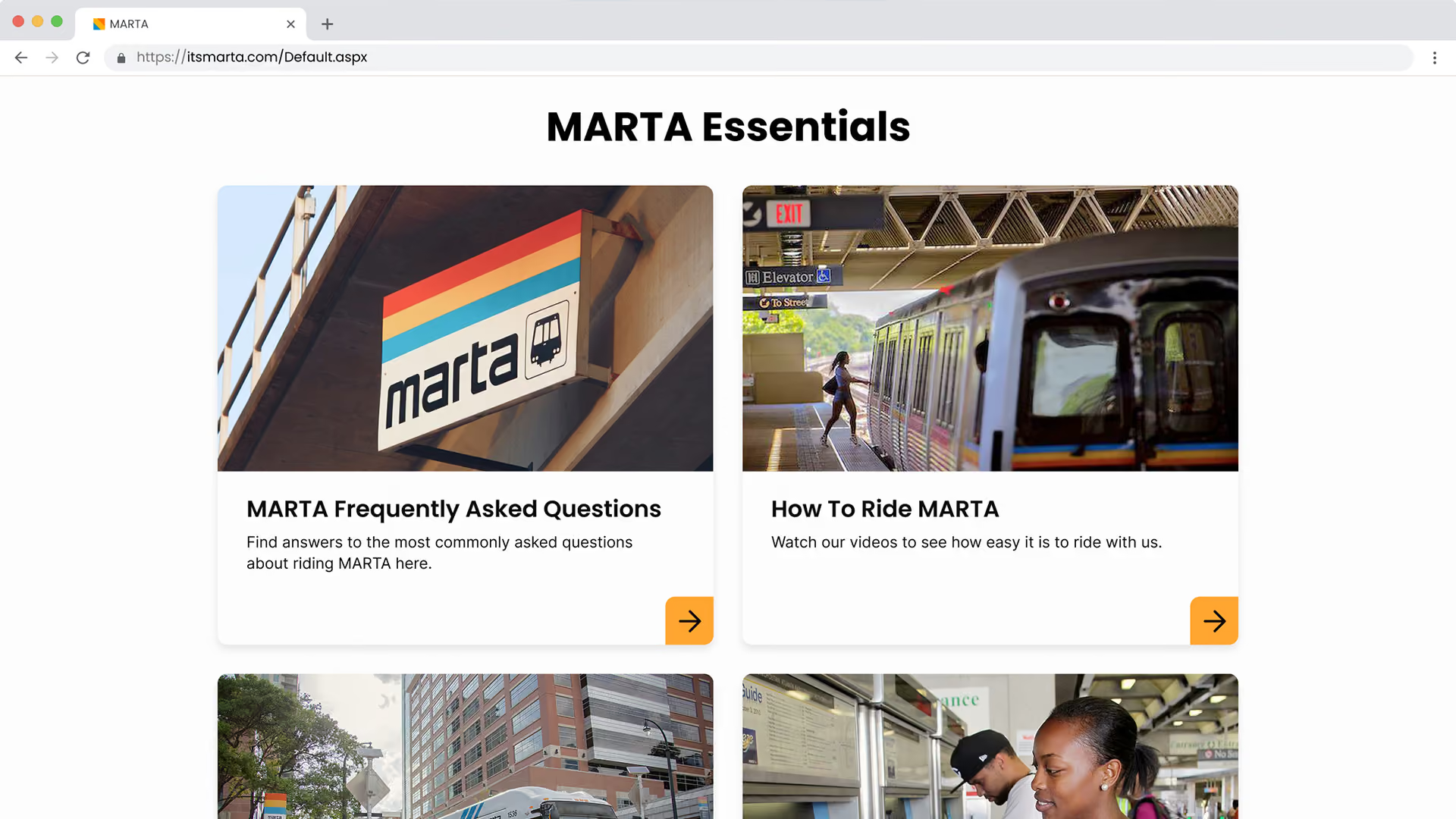
Every choice in this redesign was inspired by what users truly needed. Let’s dive into the four most significant changes.
User-centric navigation
Riders struggled to find essential trip planning information due to poor content organization.
Design Response
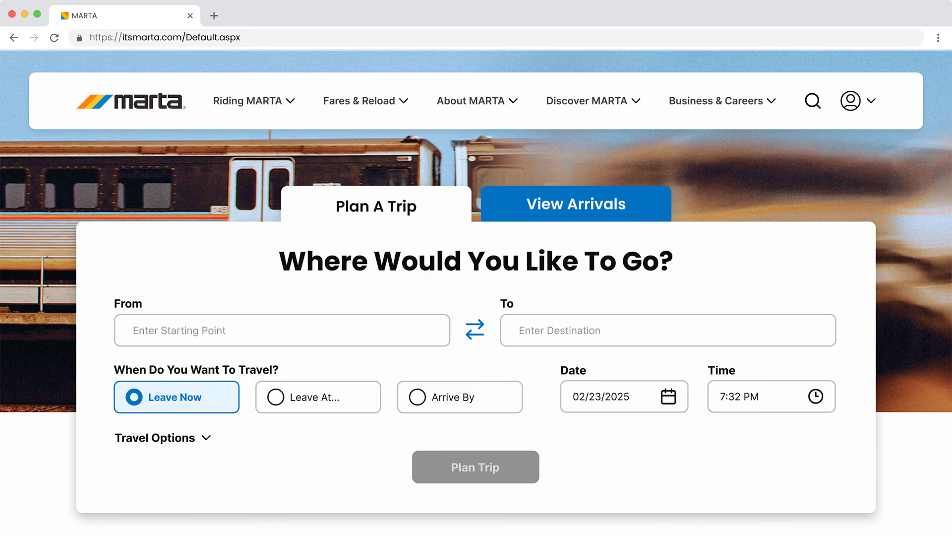
Navbar is organized to match user content expectations
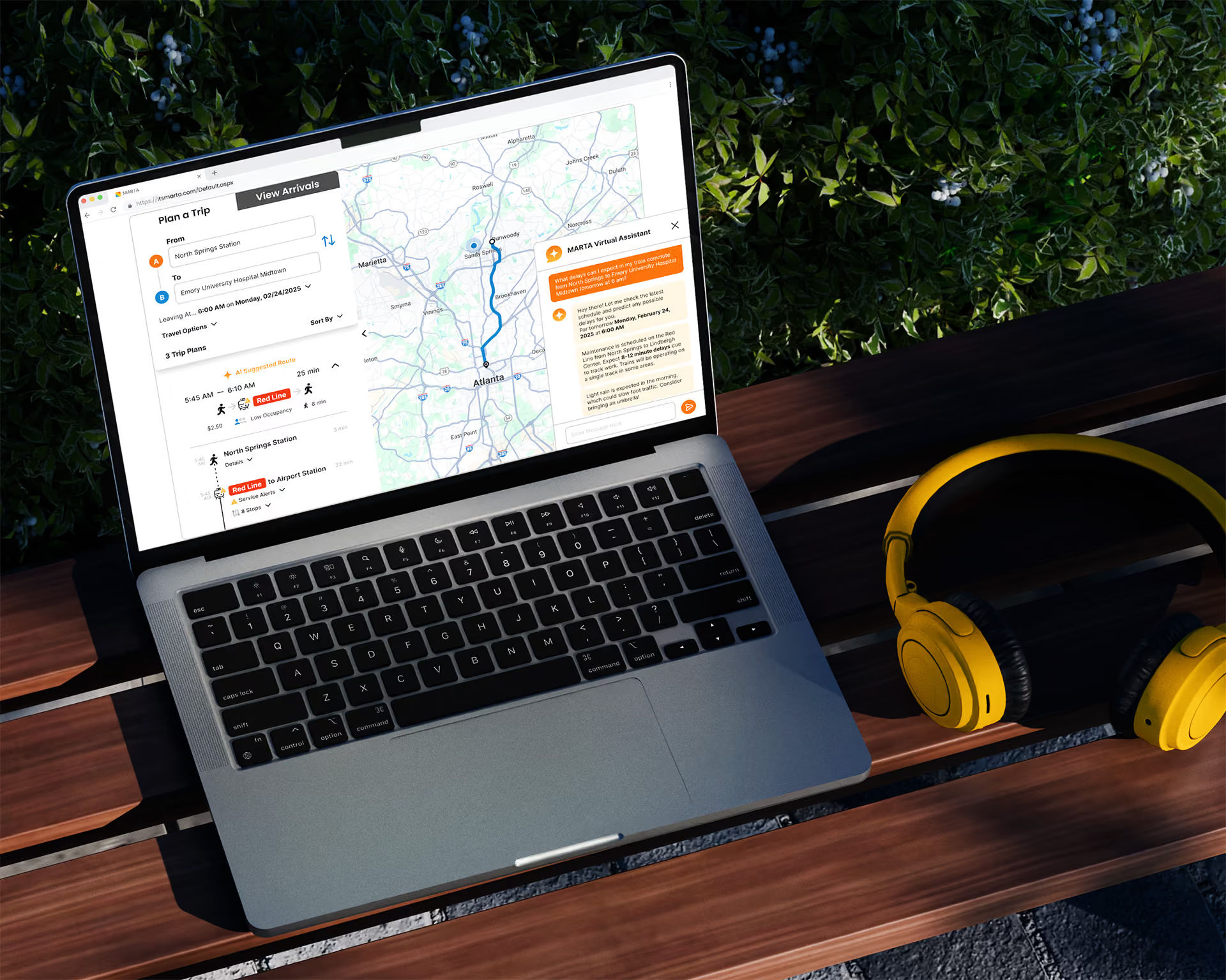
Trip planner placed front and center on the homepage
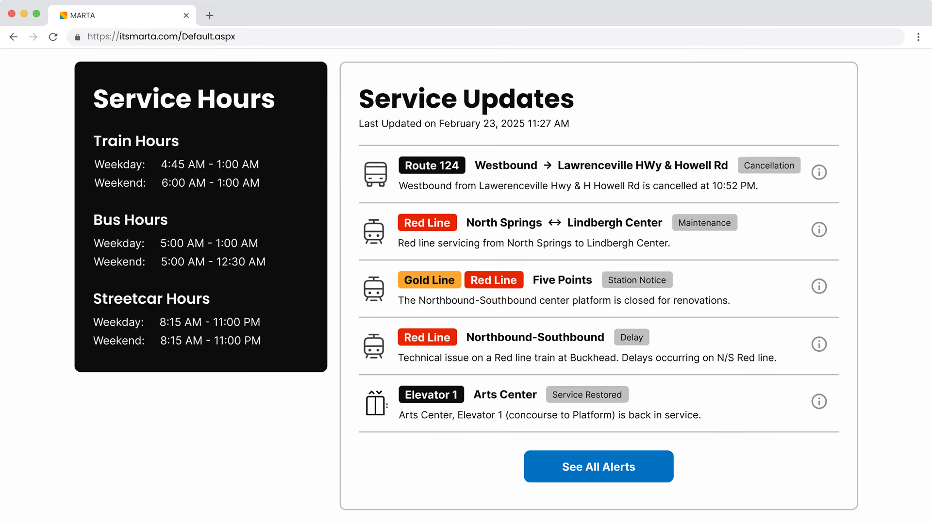
Service updates widget highlights urgent alerts
Intuitive alert system
Alerts were one of the most-used features but displayed as dense text walls with no visual hierarchy.
Design Response
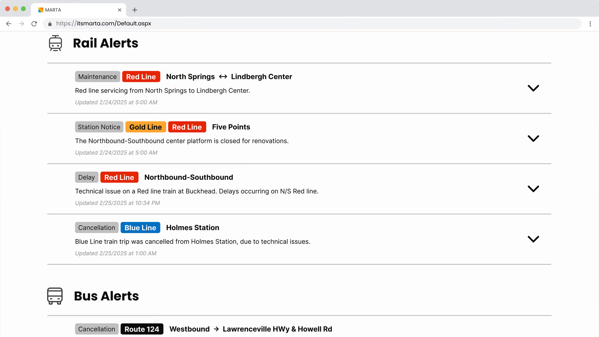
Tagged alerts by type and affected lines/routes for faster scanning
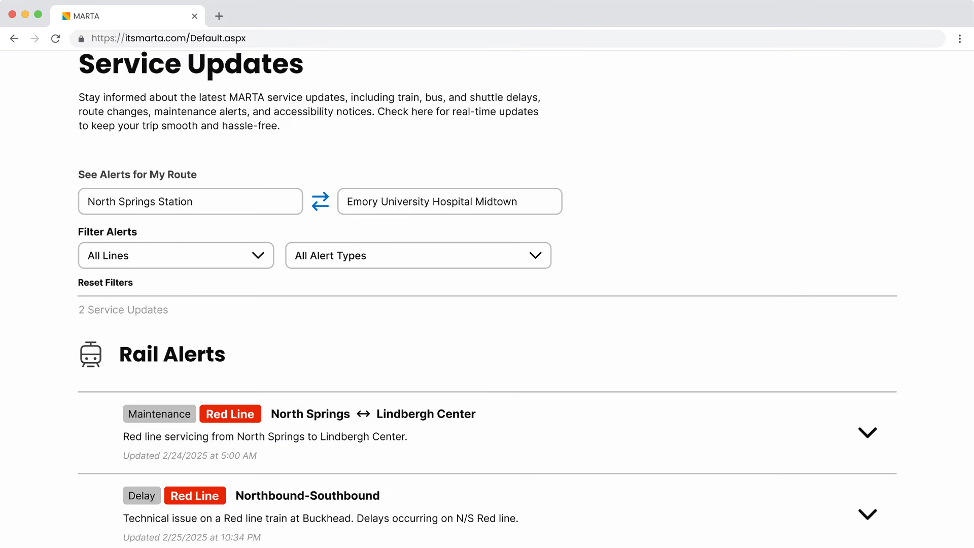
Route-based filtering so riders only see alerts relevant to their commute
Low-priority alerts like restroom and elevator delays collapsed by default
simplified Breeze card management
Any Breeze card process redirected users to a third-party site with an entirely different UI, creating a disjointed experience.
Design Response
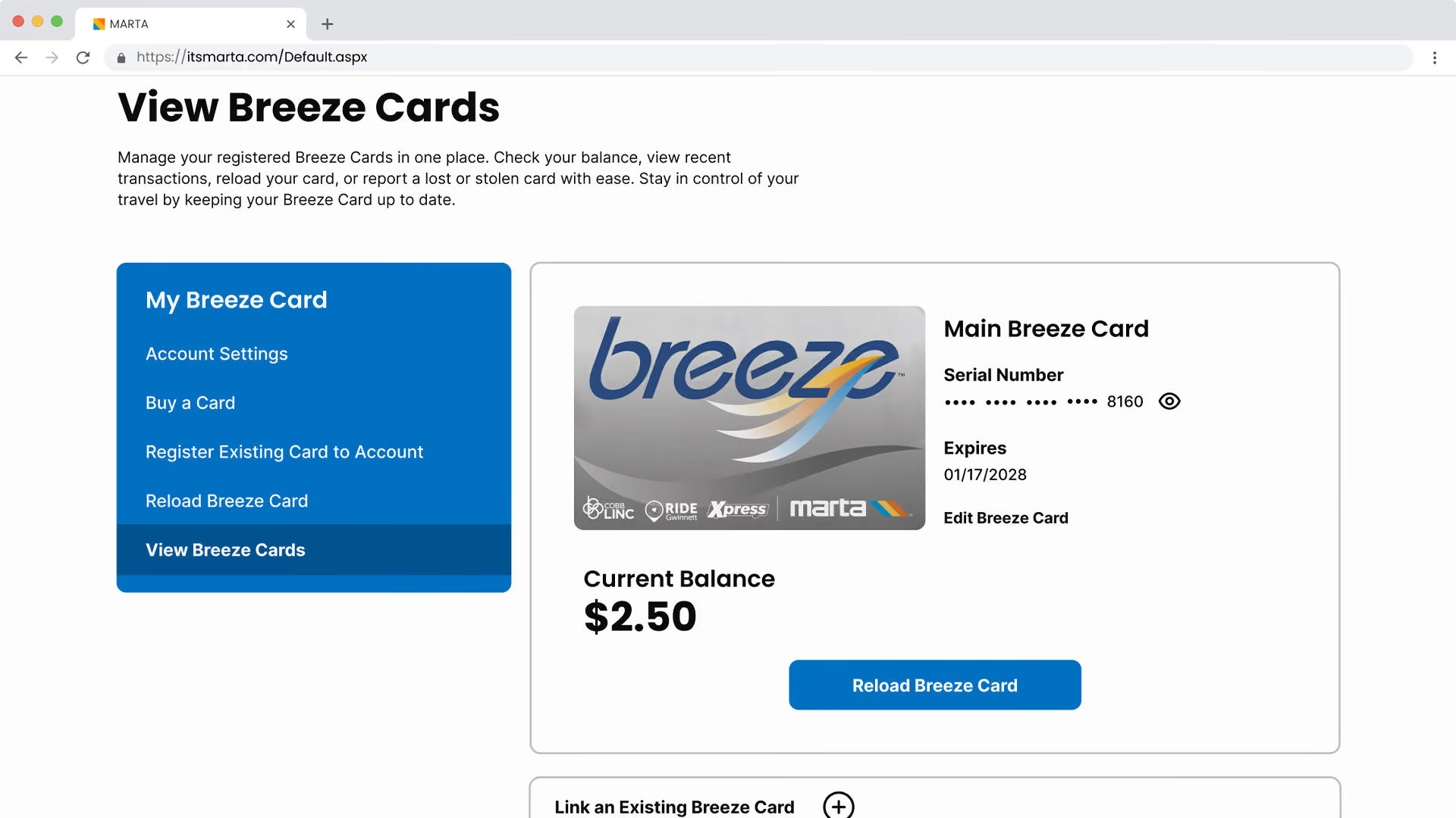
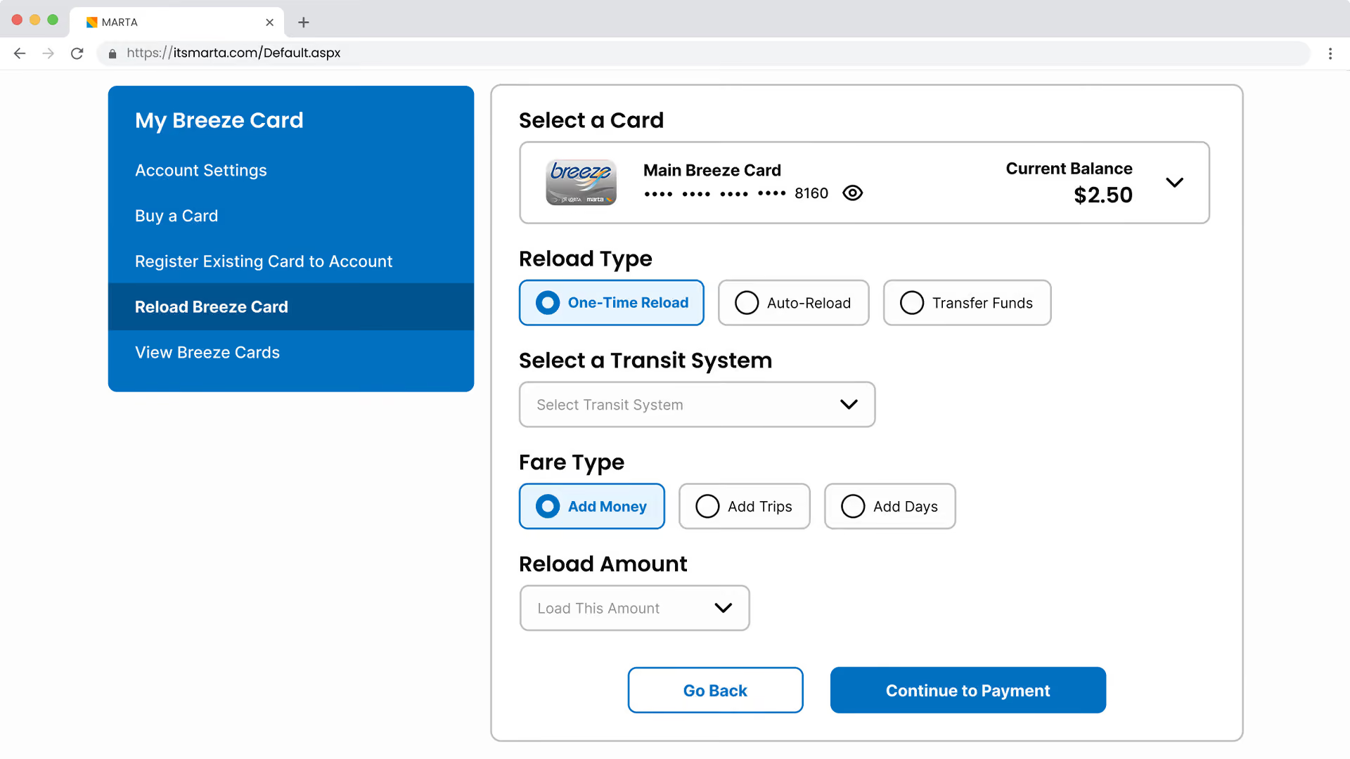
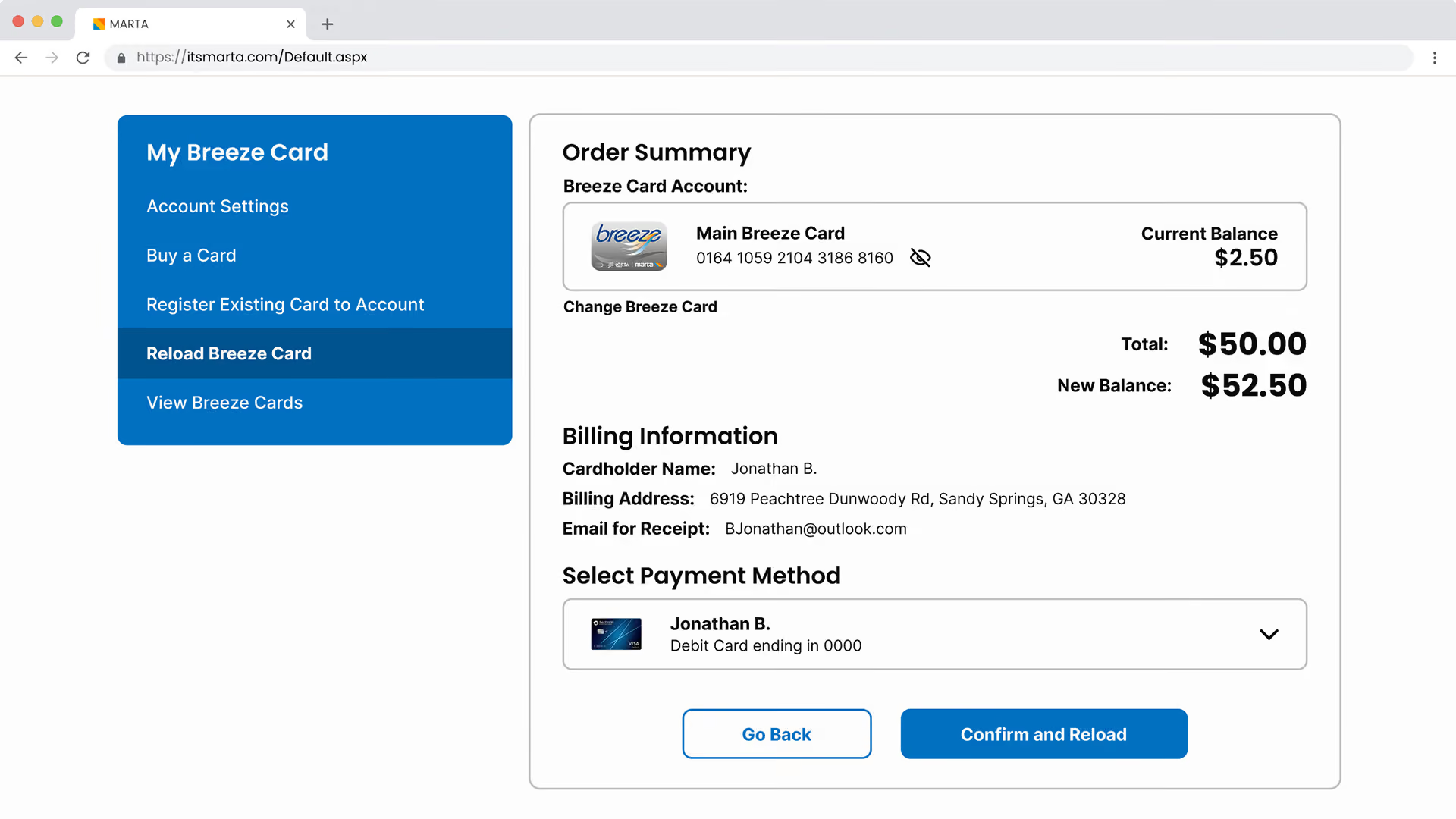
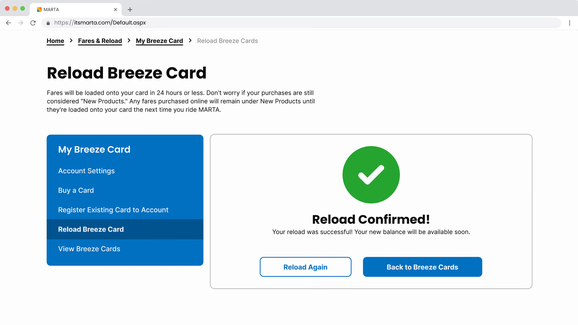
Breeze card management fully integrated into the MARTA site with a consistent UI
Reload flow broken down into digestible steps
Breeze card dashboard with card balance visible at first glance
AI-powered chatbot
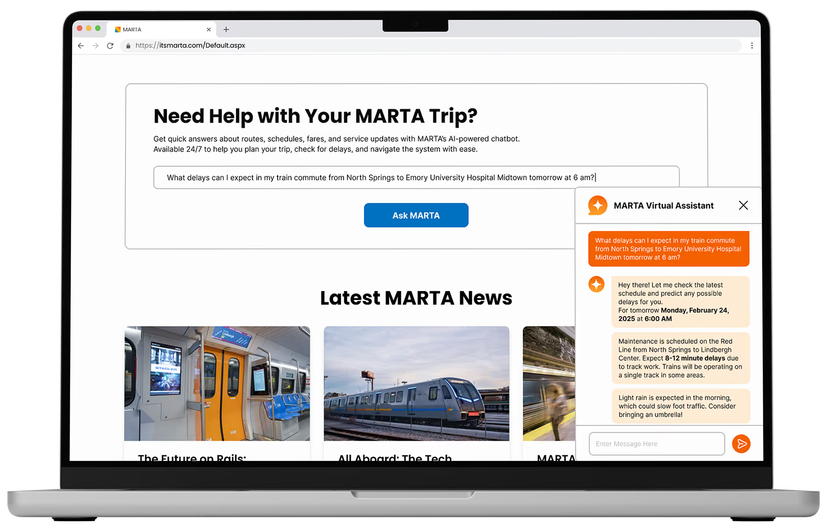
An AI chatbot was added to offer a personalized, guided experience for users.
Design Response
Proactive suggestions tailored to the rider's commute
Instant answers about routes, schedules, fares, and service updates available 24/7
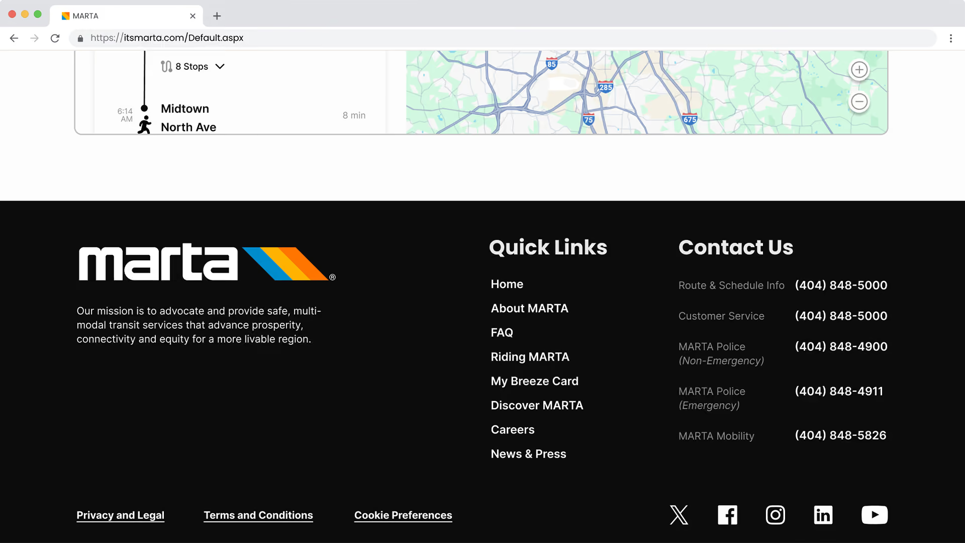
Collapsible chat window accessible throughout the site as a floating button
The finished design puts the right information in the right place to create a faster, clearer MARTA experience that riders can navigate with confidence.
What pushed me most
Synthesizing weeks of research into one clear design direction, and making judgment calls that data alone couldn't always validate.
What I'd do differently
Start with mobile. Research told us most riders browse on mobile, yet most design energy went into the desktop experience. Next time, I’ll put mobile first.
What this project taught me
MARTA's site didn't fail because it was ugly; it failed because it tried to show everything at once. Balancing information density with usability changed how I think about design fundamentally.
The mental model disconnect between how the agency organized information and how riders actually think about transit was the core problem. Everything else was a symptom.