UX Researcher, Product Designer
5 UX Designers
Figma, FigJam, Miro, Adobe Photoshop, Adobe Illustrator, Zoom
Rhythmiq is a mobile music discovery app designed to make finding new music feel exciting and personal again. Built as a final group project during a UX Bootcamp, the app tackles a common frustration with today's streaming platforms: recommendations that feel stale and repetitive. Rhythmiq introduces a swipe-based discovery mechanic inspired by speed dating: users preview 30 seconds of a track, then swipe right to save or left to skip. Every interaction feeds a real-time recommendation engine, creating a loop that feels responsive, intuitive, and genuinely fun.
Music is personal. Yet somehow, the platforms built to help us discover it keep serving us the same songs on repeat.
Our team of five landed on designing a music discovery platform fast, because we all felt it. The frustration of opening music streaming apps and seeing the same algorithm-approved playlist. The feeling that the apps know your history, but not your taste. The solution came in the form of a mobile app that reinvents music discovery as speed dating, helping listeners break free from mainstream repetition and discover music that truly matches their preferences.
This project began as a collaborative research effort with five teammates, covering heuristic evaluation, user interviews, survey, competitive analysis, card sorting, and usability testing. Once the research phase concluded, I took full ownership of the design as UI Lead, from lo-fi wireframes all the way through the final hi-fi prototype, translating what users told us they needed into an experience that delivered it.
Streaming platforms struggle with helping users discover new music. They have plenty of data, large libraries, and advanced algorithms, but people still feel like they keep hearing the same songs over and over.

Recommendations feel recycled
Algorithms are optimized for engagement, not exploration. They push what's already popular, leaving listeners who want new artists and niche genres completely behind.
Discovery is exhausting
Finding something new means hunting playlists, waiting on delayed algorithm refreshes, or scrolling TikTok hoping the right song appears by chance. Overwhelming and rarely worth it.
Before we could design a better discovery experience, we needed to understand how people actually experience music discovery today: the habits, the frustrations, and the moments where every existing platform falls short.
Across every platform we reviewed, the finding was consistent across all of them: no platform gave users a meaningful, active role in shaping their own discovery. The opportunity space was clear.

To capture both breadth and depth, we combined qualitative and quantitative research methods, then synthesizing everything into the insights that shaped our design direction.
Hover over the rings for research details!
Tap on the rings for research details!
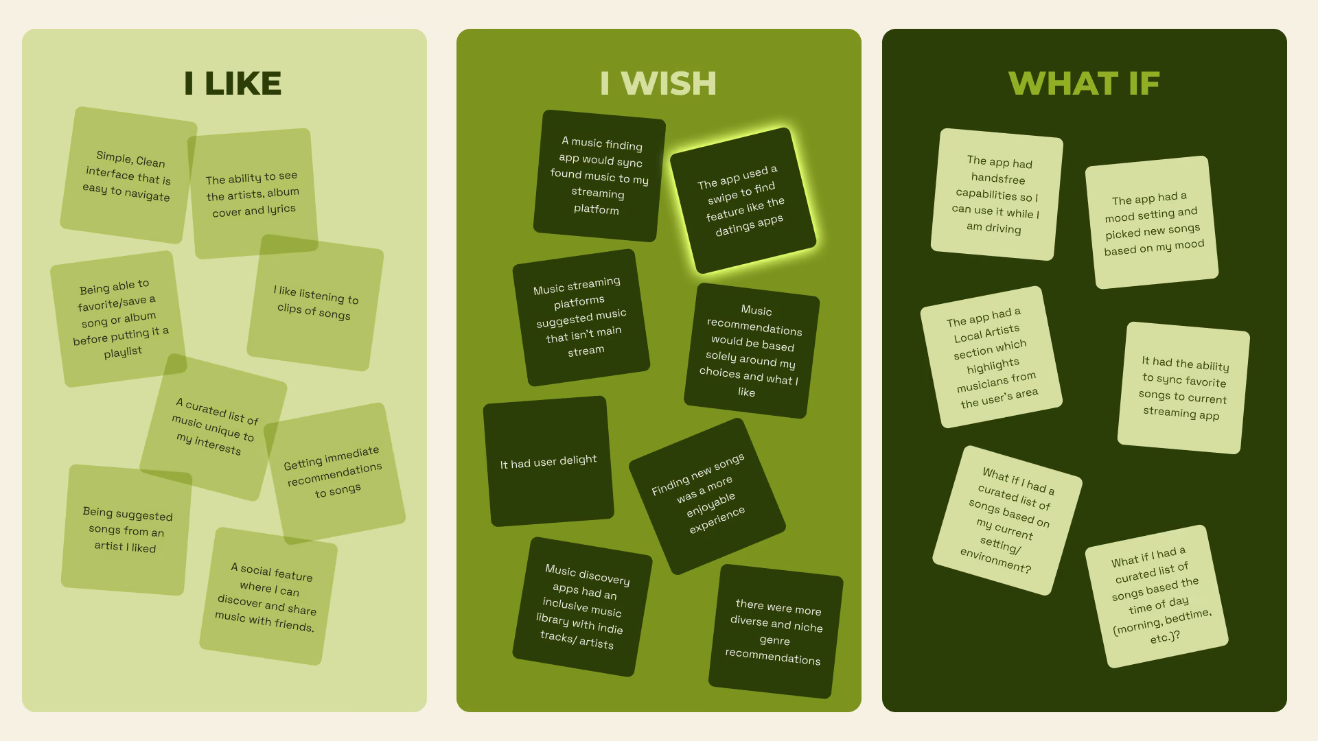
Interview data was organized through an affinity diagram, grouping themes and pain points until the real patterns emerged. Three insights rose above the rest.
Users want to find lesser-known and underground music, but feel their platforms are built to work against that goal.
Finding new music isn’t easy. Scrolling through playlists and waiting for algorithms to update is tiring and rarely feels worth it.
Mood and environment shape what users want to hear, but algorithms can't keep up with shifts that drastic, leaving listeners stuck with suggestions that no longer fit
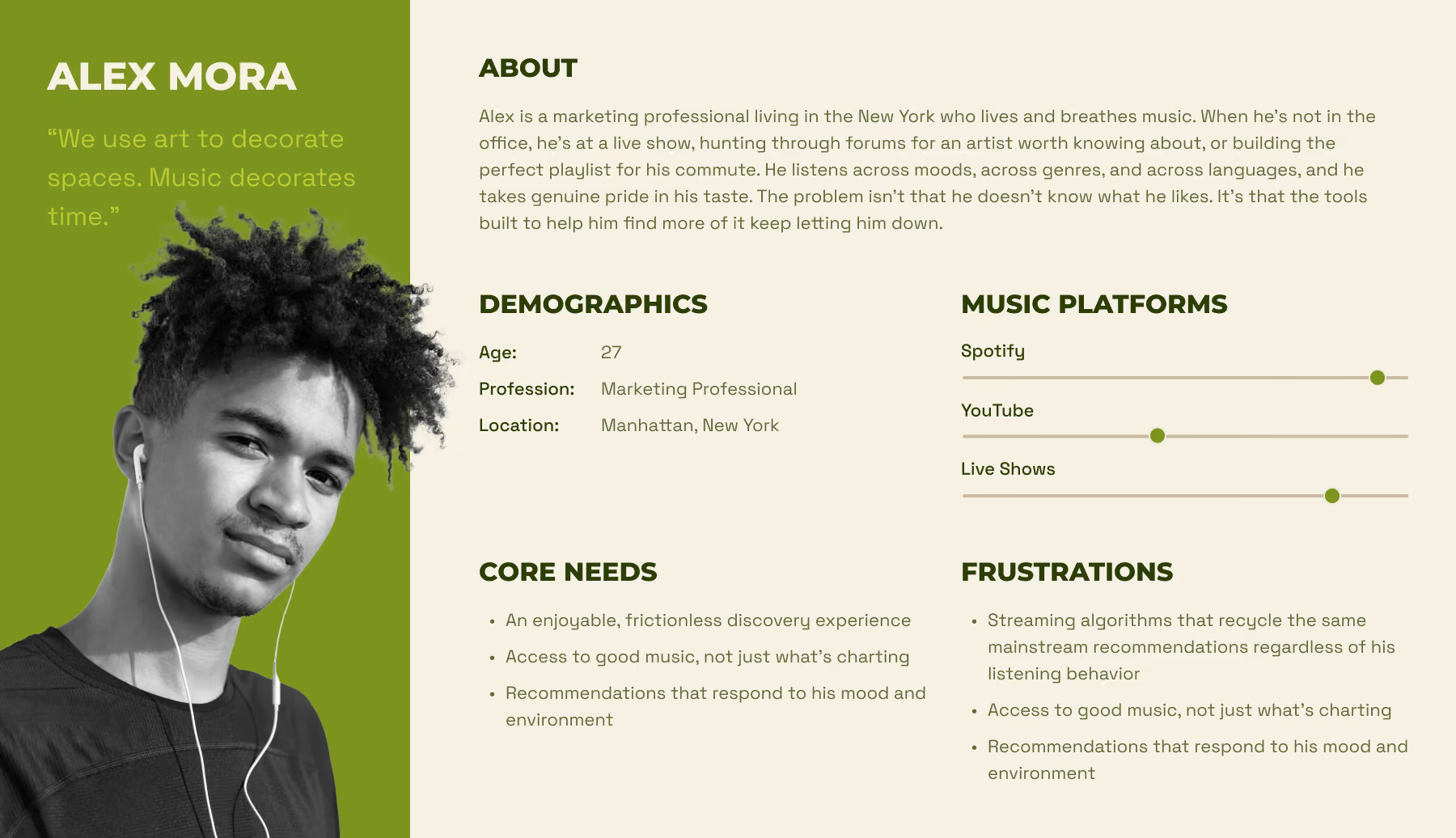
With our insights mapped, we built a persona to give our research a human face. This became someone we could design for, argue over, and return to whenever a decision felt uncertain.
The research phase highlighted the shortcomings of current platforms. Our next task was to translate the problem we intended to address to design the experience we envisioned. We brainstormed the core interaction model and developed a site map and user flows to lay the groundwork for the app's design.
Create a music discovery experience that feels personal, intuitive, and exciting enough to help enthusiasts find music they've never heard without the friction of existing platforms?
We opened the floor in FigJam and let ideas run. The swipe mechanic surfaced early and stuck. An interaction pattern users already understood intuitively, applied to music discovery in a way that hadn't been done with this level of intention.
Mapped how a user would typically move through the app in three primary user flows: favoriting a song, building a playlist, and syncing to an external streaming app.
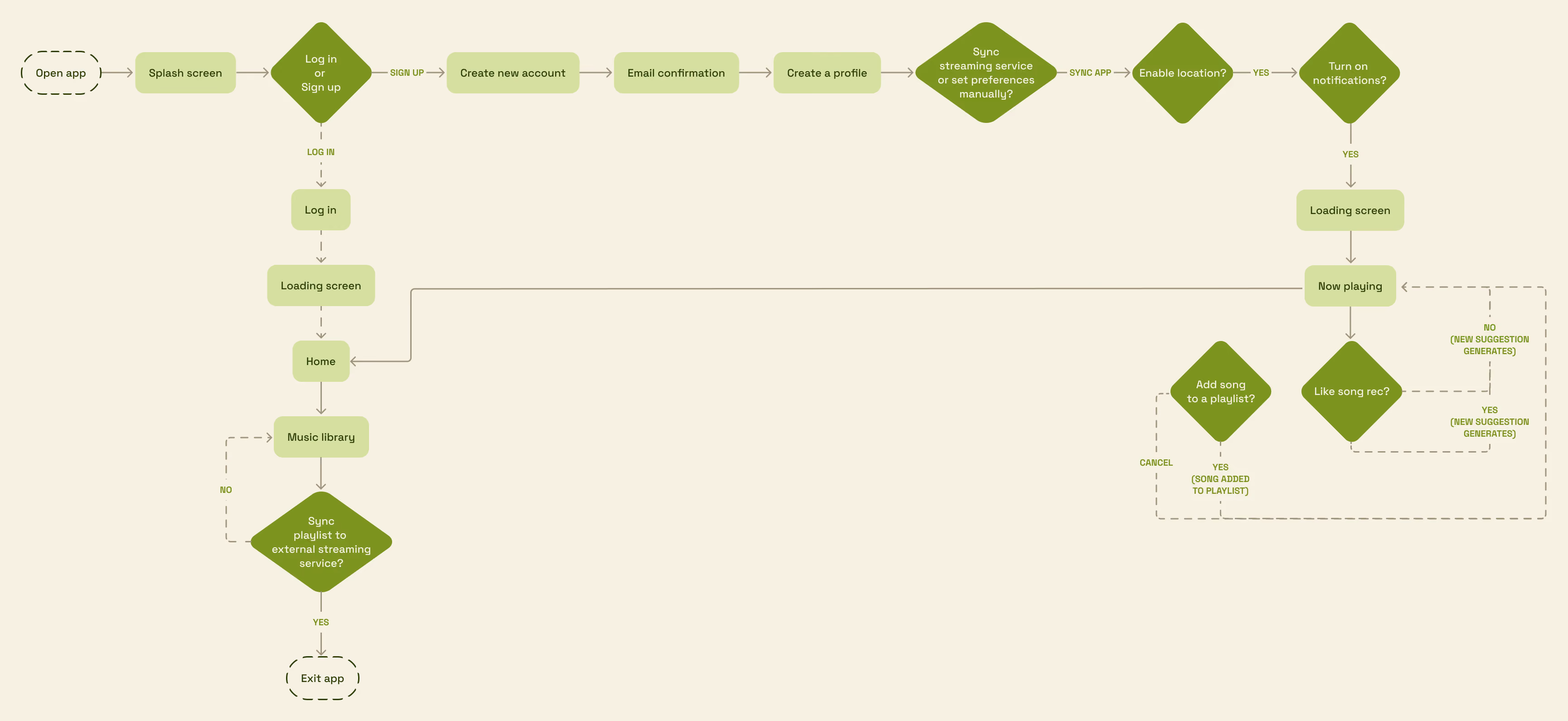
With the structure mapped and the direction clear, it was time to start making it real. This phase was about moving fast, testing early, and letting user feedback shape the product.
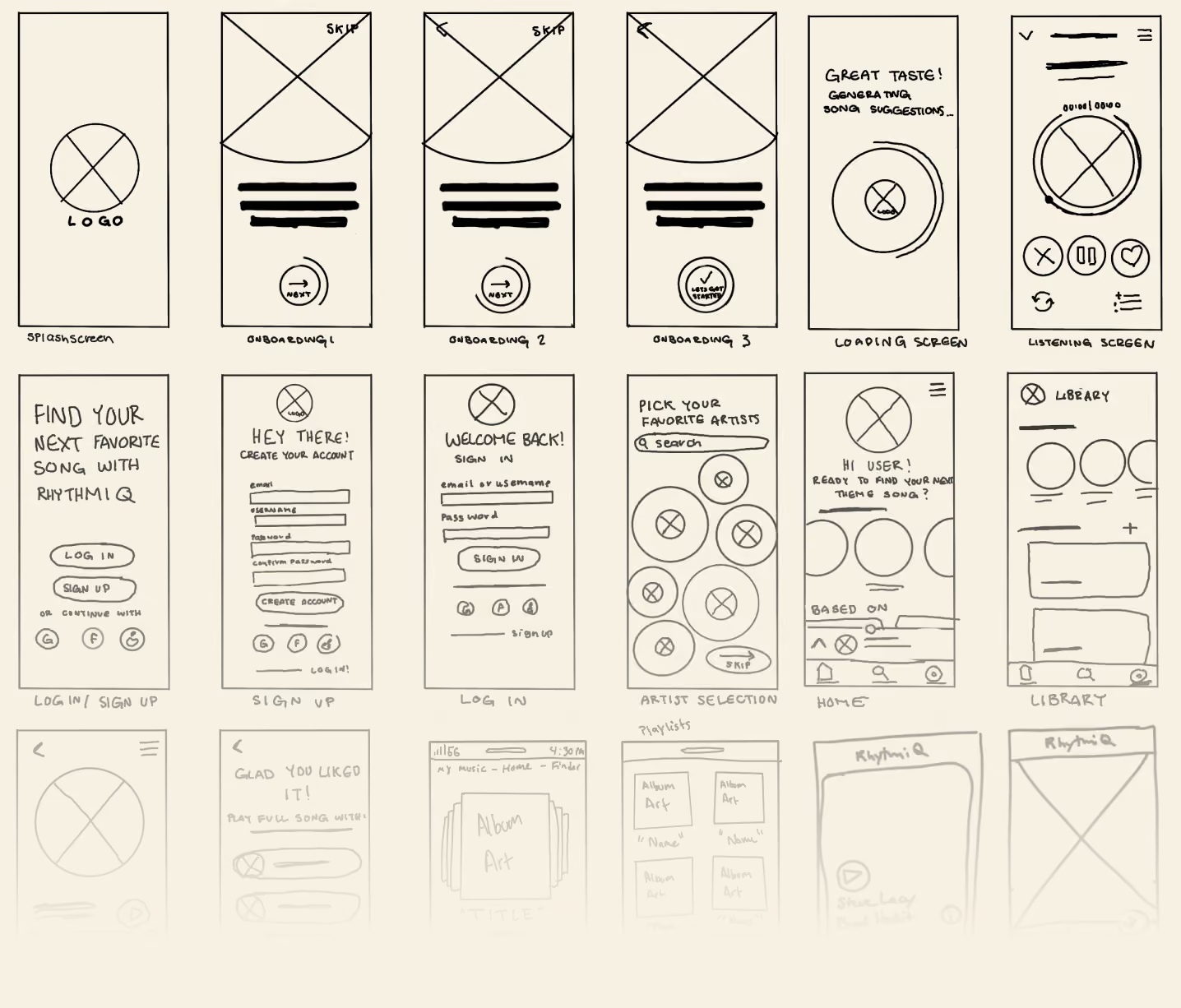
Everyone on the team started by sketching ideas on their own. After that, we came together to review and improve the concepts, then built a simple prototype in Figma for a structured, testable experience..
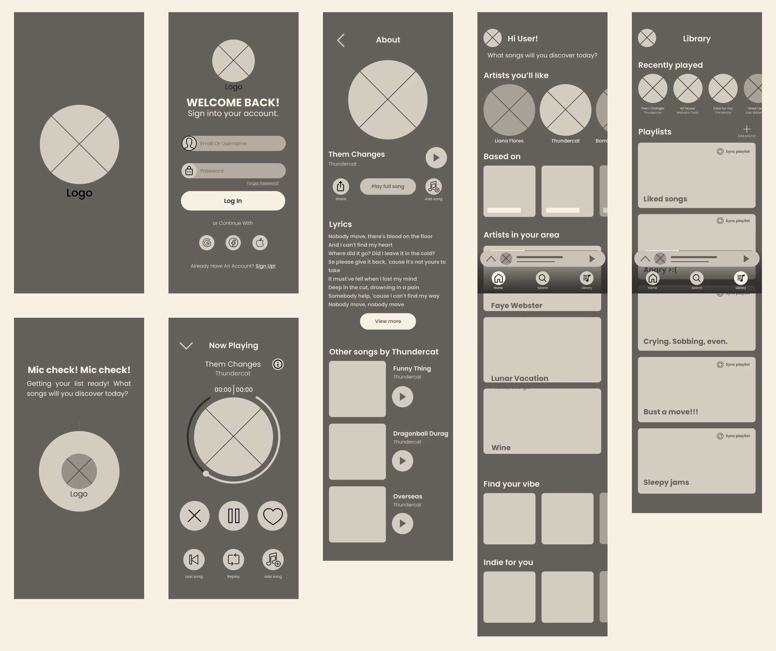
We ran 6 moderated usability tests across 3 tasks: swipe to like a song, add a song to a playlist, and sync a song to a streaming app.
70% success rate
100% success rate
100% success rate
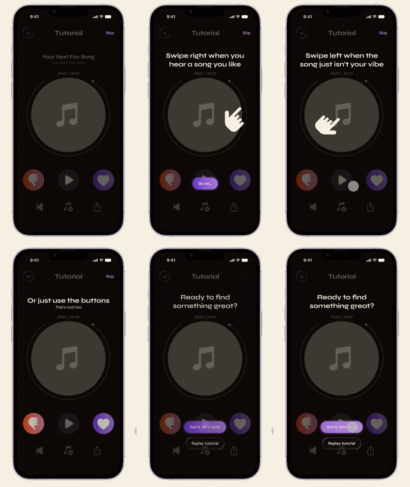
In task 01, 4 out of 6 participants either tapped the heart button or couldn't figure out how to like a song at all, revealing that swipe gesture simply wasn't discoverable on its own.
Task 01 drove two changes that made it into the final design.
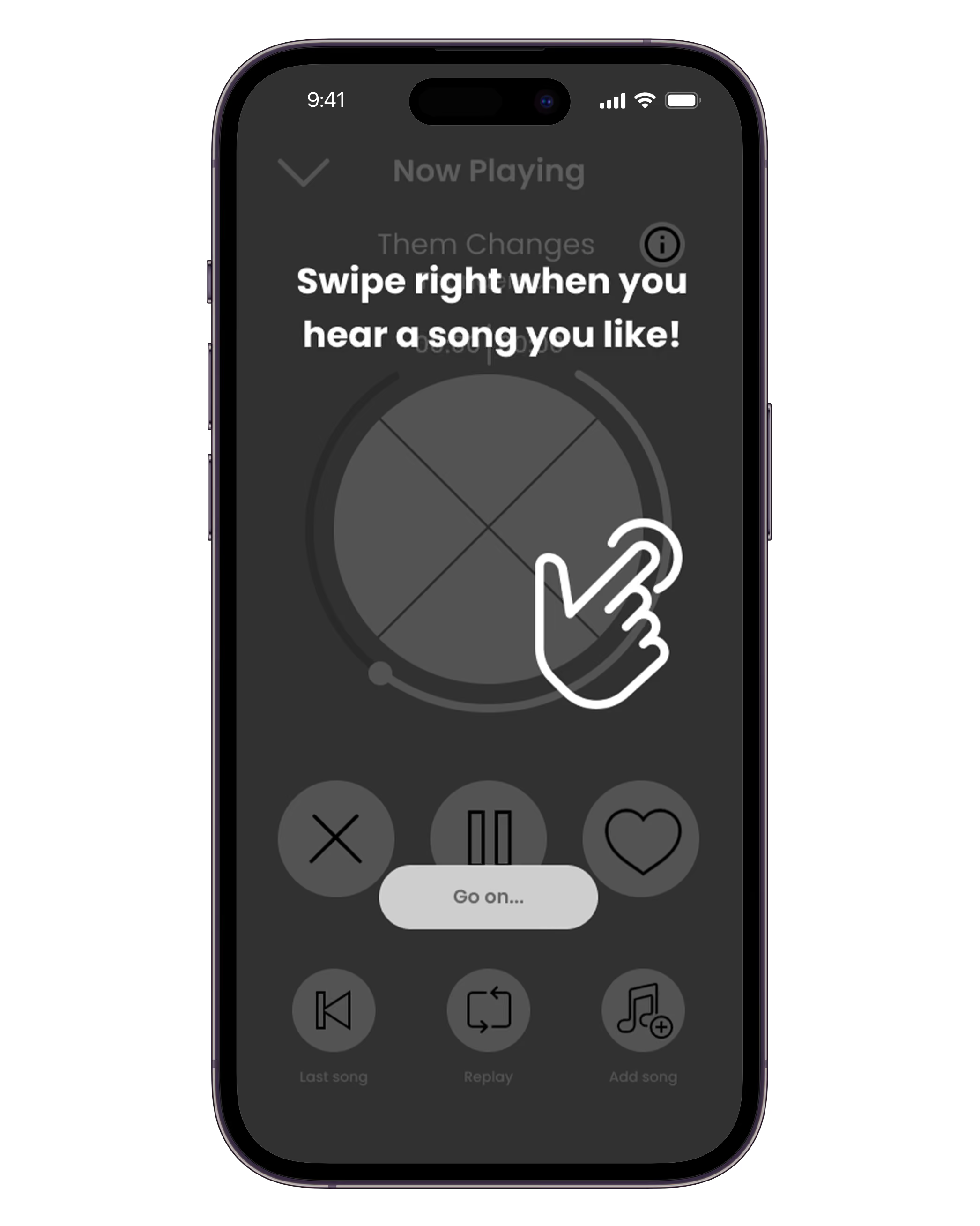
Introduce the swipe mechanic before users start exploring.
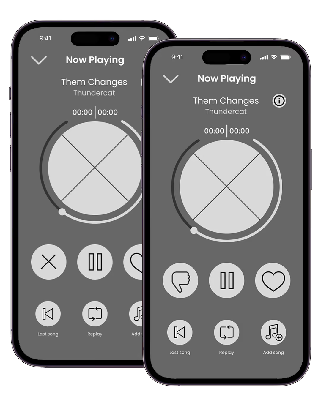
Reads as a clearer signal for disliking a song in a music context.
Dark backgrounds keep album art front and center, while contrasting vibrant colors, communicate the idea of all the bright discoveries users will encounter as they explore new genres and artists.
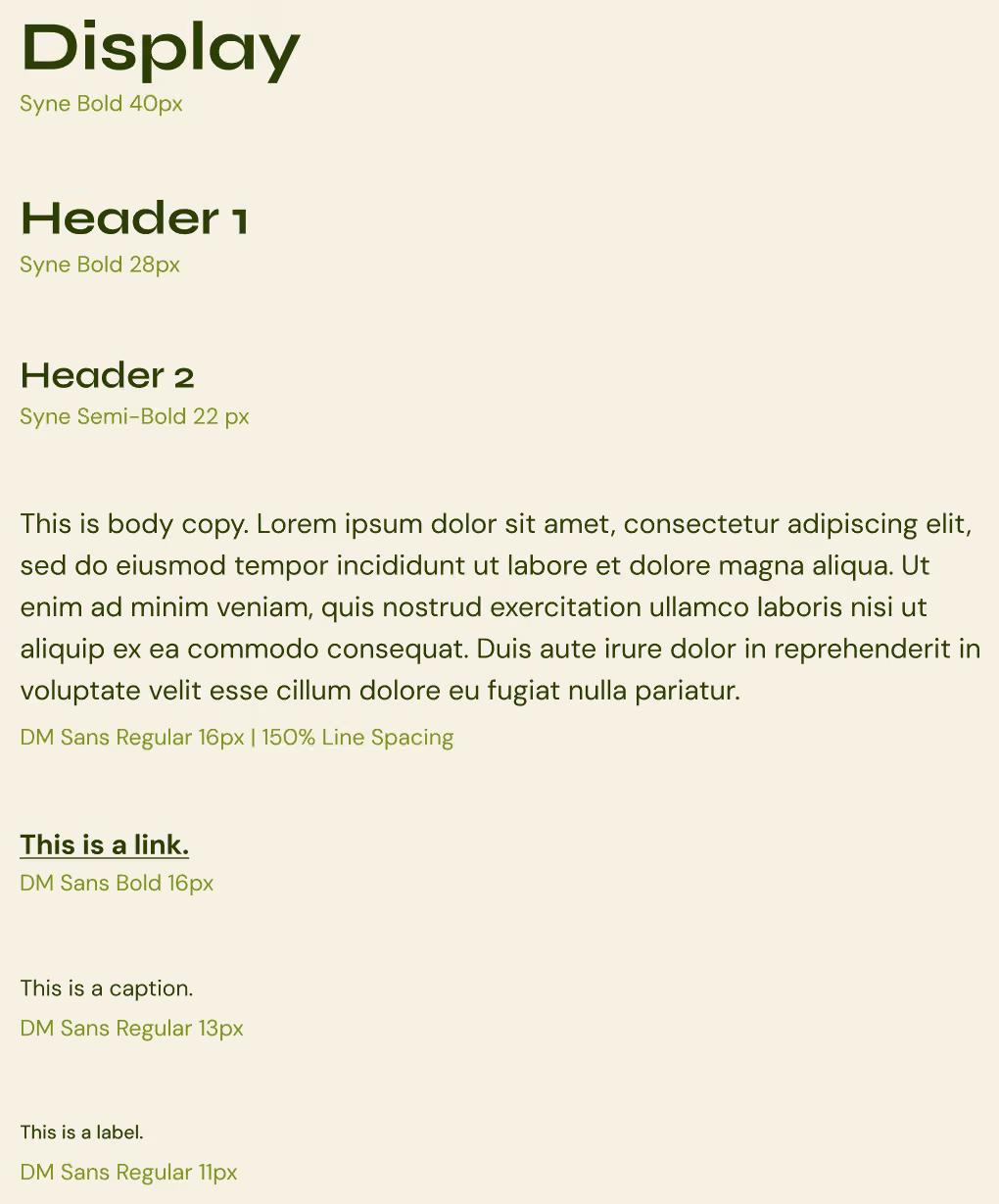
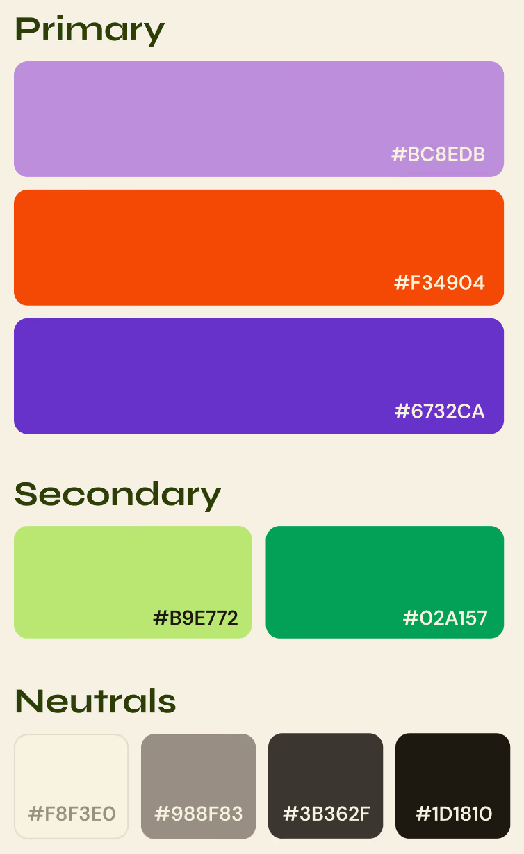
Every choice in Rhythmiq was traceable back to something a user told us. Here are the decisions that shaped the experience most.
Swipe-based discovery
Existing platforms offered no active role for the listener as recommendations just appeared with no feedback mechanism.
Design Response
30-second song previews give users just enough to make a call
Swipe right to save, left to skip, updating suggestions in real time
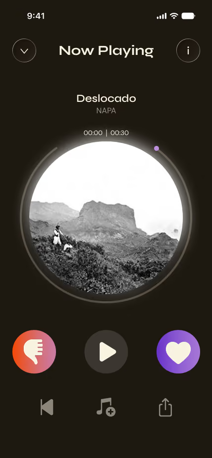
Heart and thumbs down buttons remain permanently visible below the card for users who prefer tapping over swiping
Contextual discovery categories
Users wanted to discover music outside of genre matching, artists nearby, sounds that felt independent and unforced.
Design Response
'Artists in Your Area' surfaces local and emerging artists based on the user's location
Vibe and hyper-specific genre cards give users an even more granular level of control
Recommendation cards tailored to songs users like, recent favorites, top artists, personal playlists, or current listening trends.
Streaming sync flow
Users building a playlist inside a new app shouldn't have to abandon their existing streaming library to enjoy what they find.
Design Response
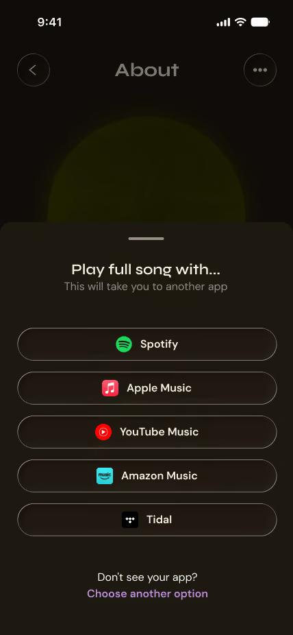
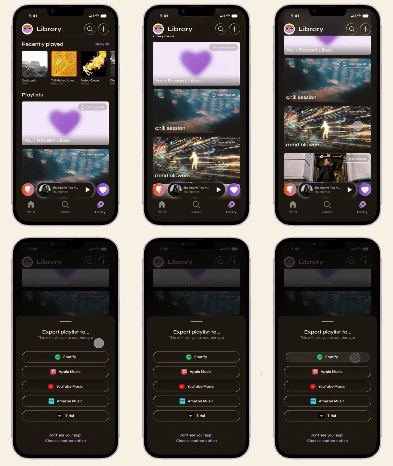
An export flow lets users send saved songs or full playlists directly to their preferred platform
RhythmiQ becomes a discovery layer that lives on top of wherever users already listen
The finished design puts the listener in control in an experience that surfaces music that actually resonates, without the friction that makes discovery feel like a chore.
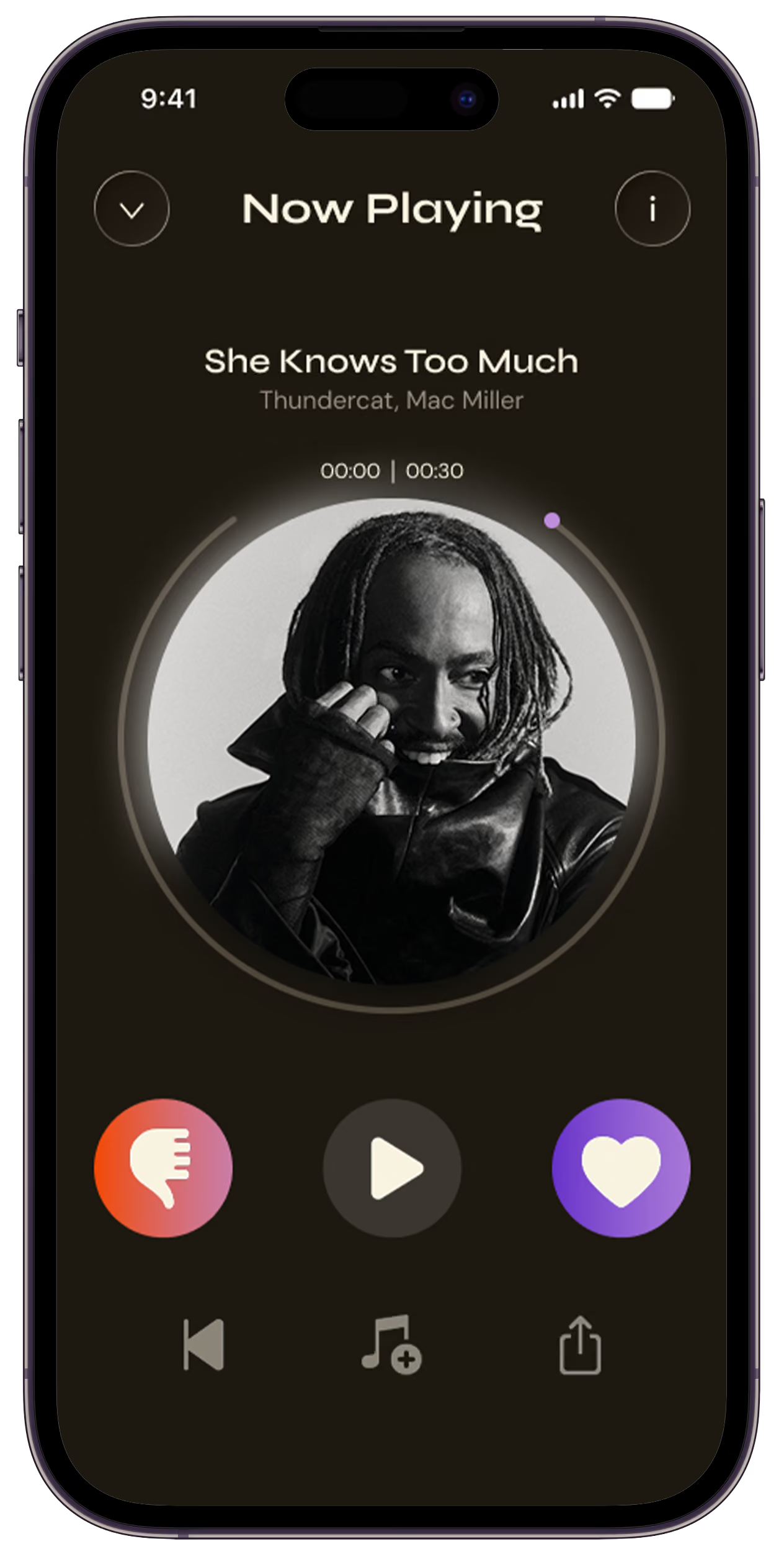
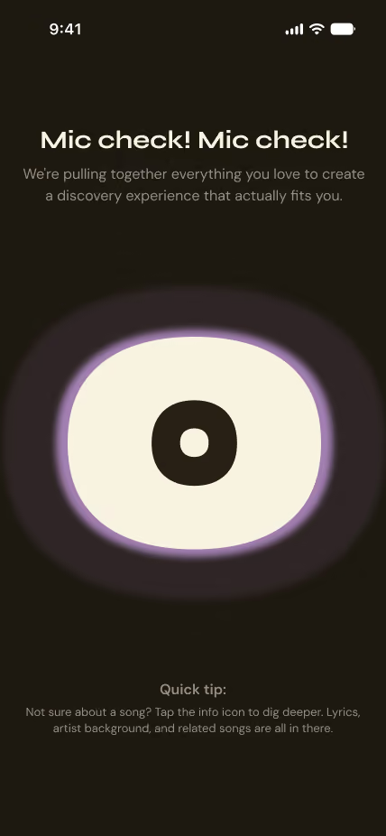
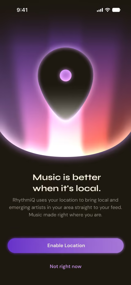
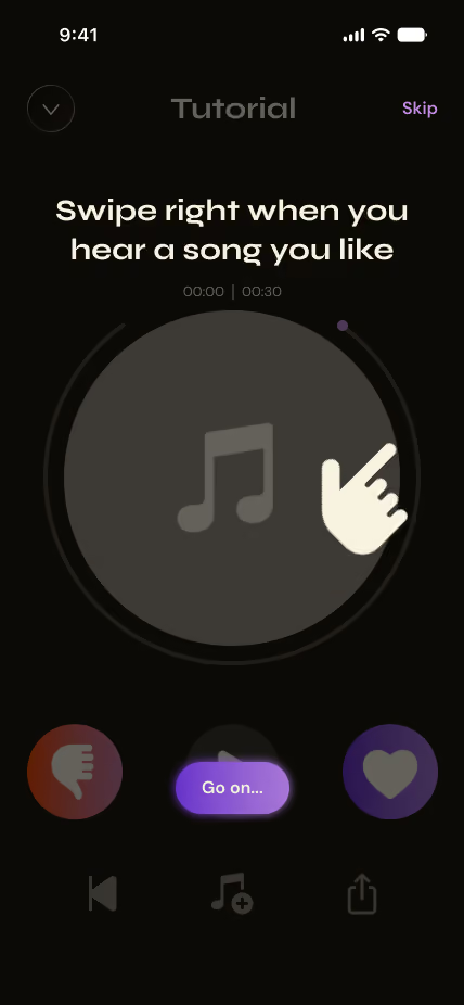
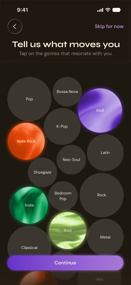
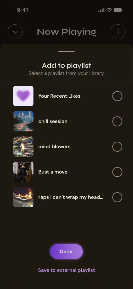
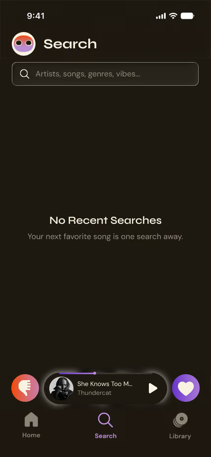
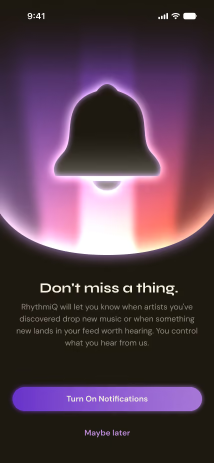
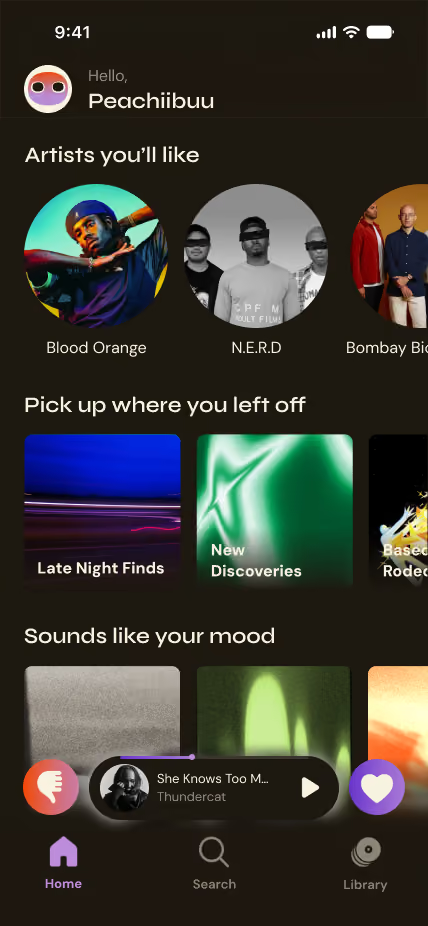
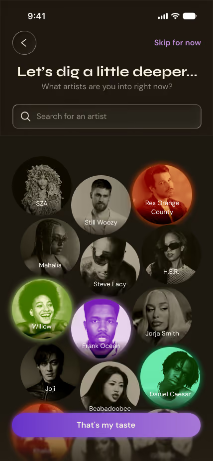
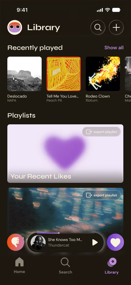
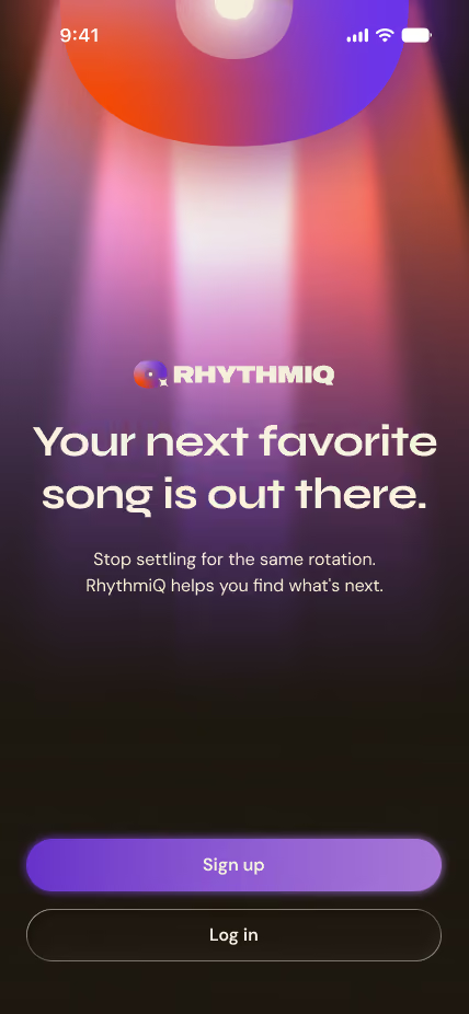
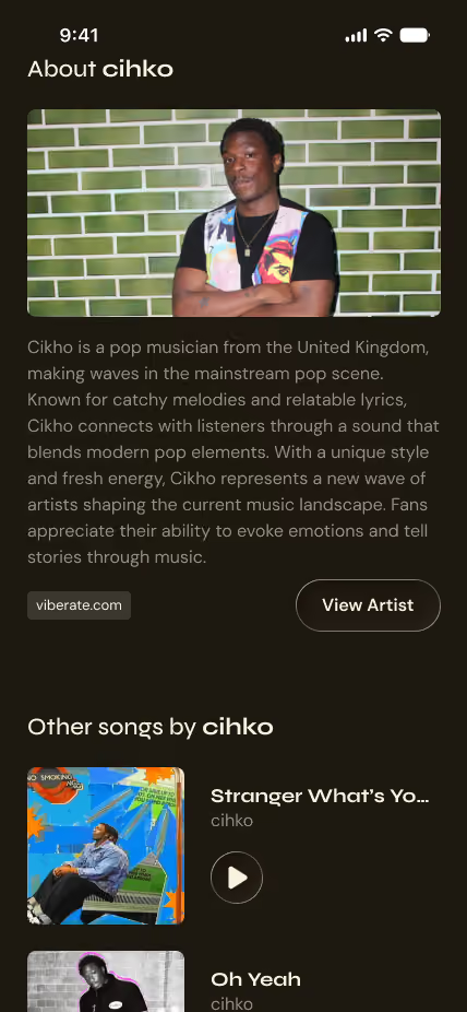
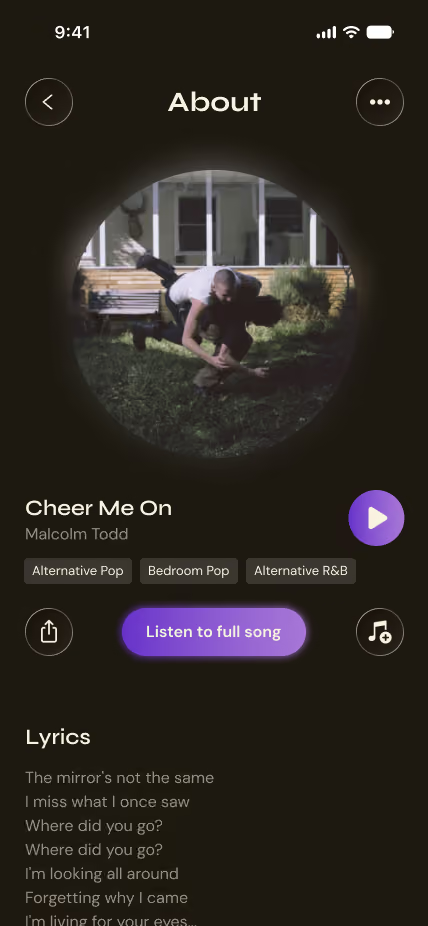
RhythmiQ walks first-time users through a guided setup that establishes their taste before they reach the discovery feed.
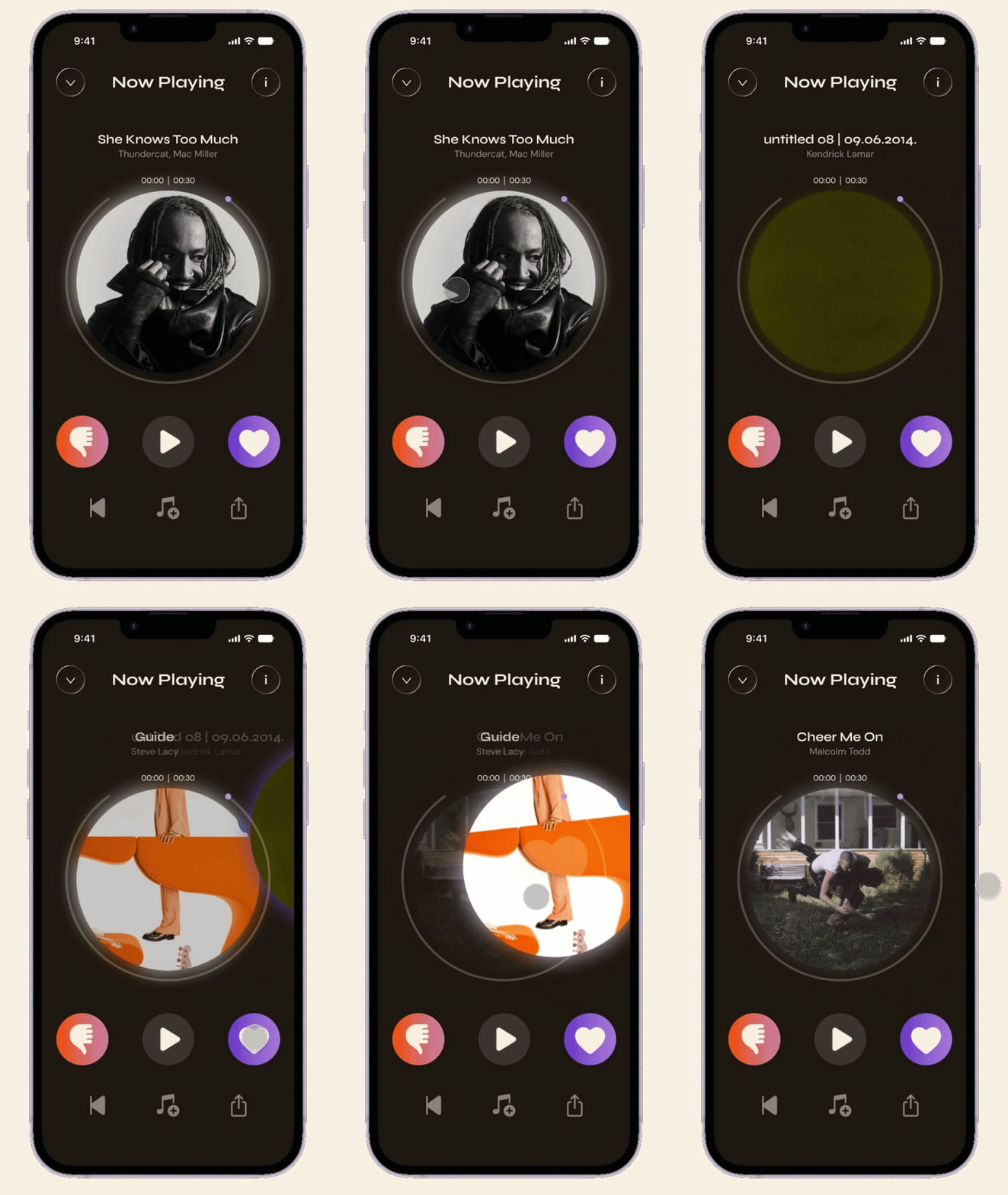
Swipe right or tap the heart to like a track. A single gesture that saves the track and refines recommendations simultaneously.
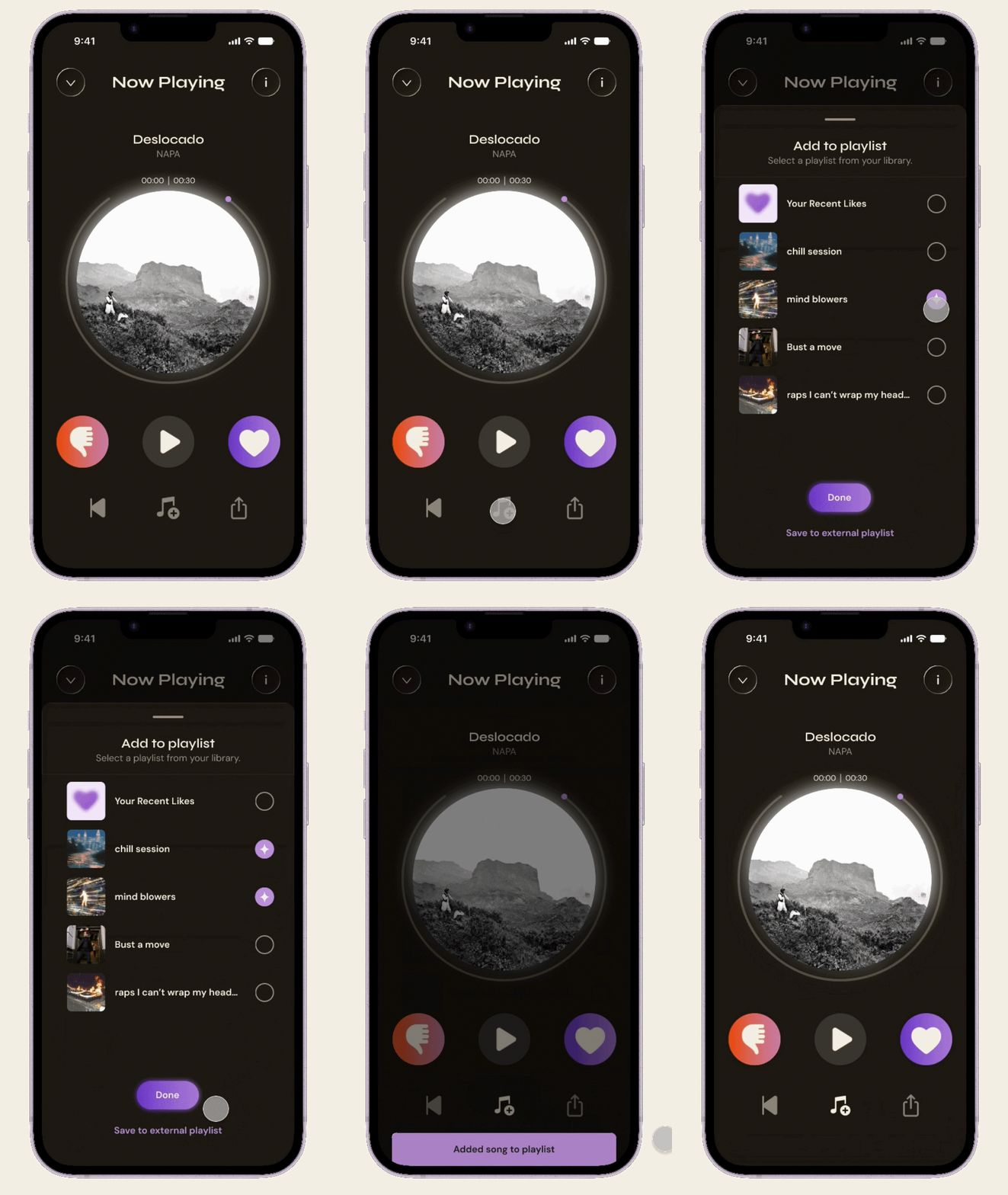
Users can create their own playlists for their new finds and save tracks without ever leaving the discovery feed.
Send a liked song or full playlist to user's preferred platform through a clean flow.
What pushed me most
Leading the full design phase independently while staying grounded in what research actually told us rather than what felt right in the moment.
What this project taught me
Not all solutions have to reinvent the wheel. Sometimes the most effective design lives alongside existing tools rather than replacing them by solving the specific problem they can't.
"Art decorates space. Music decorates time."
-Research participant